Smart TV for Game Rooms
UI/UX
2026
Politecnico di Milano
Berardini Cristiana
Buttazzoni Carlo
Delaini Francesco
Ng Jing Wen
Scherini Gaia
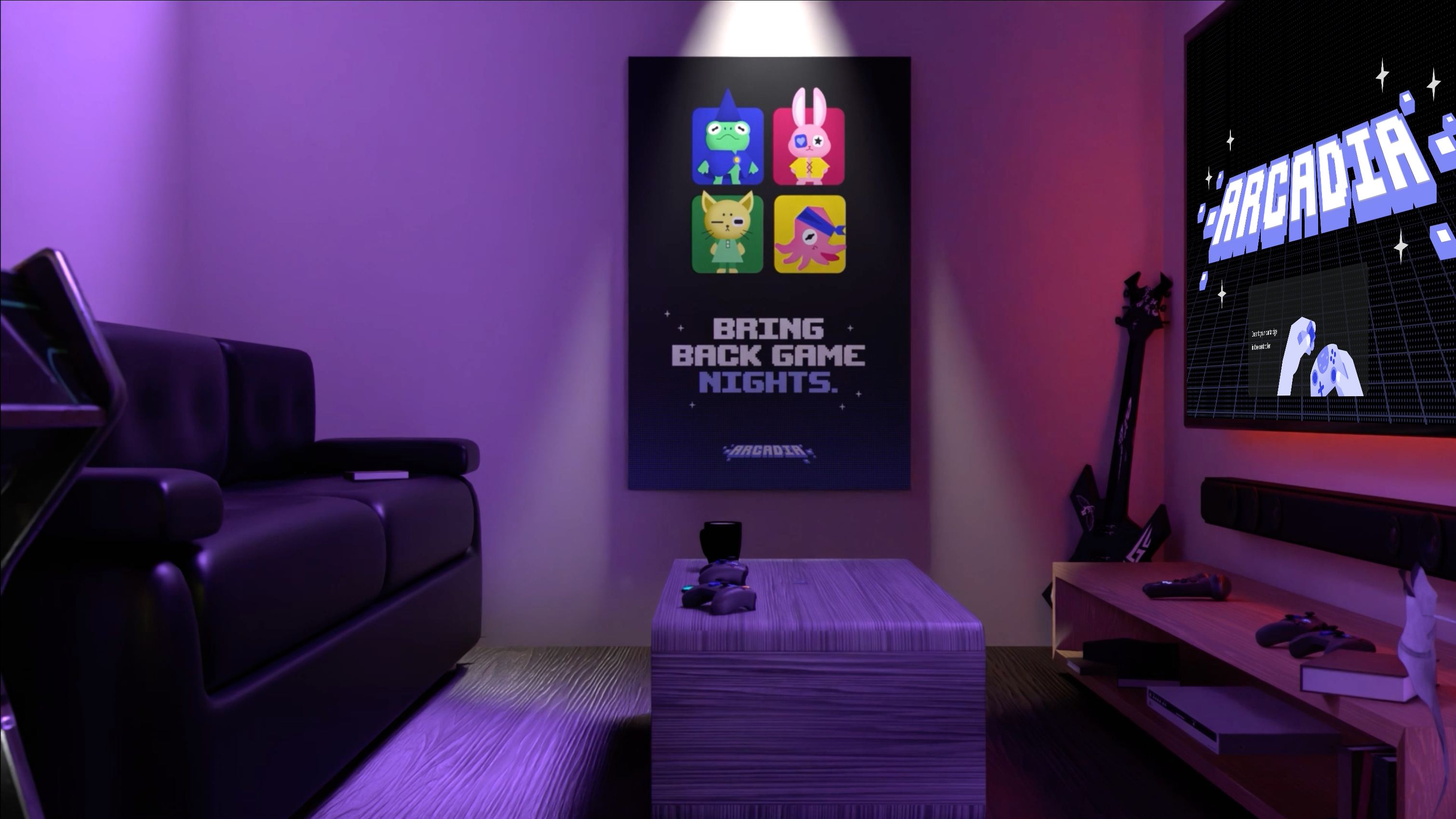
Smart TVs are fading into the background. They have become irrelevant to the generation that grew up on screens. Is the TV truly obsolete, or has its design simply failed to keep up with how people actually live? My team set out to give it a new meaning.
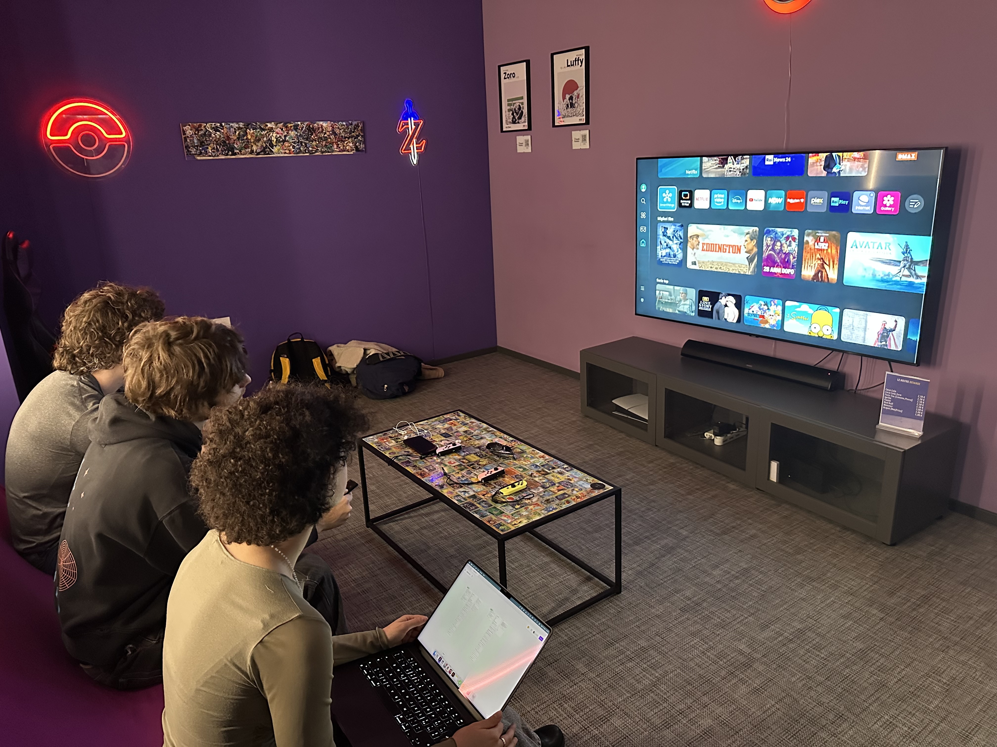
Our team chose the private game room, a bookable entertainment space where a central Smart TV anchors a shared experience across gaming, karaoke, streaming, and socialising.
UX Research
Game rooms in Milan are struggling. Even when the late-night game bar was packed with young people, the Smart TVs faded into the background. Present, but it was never part of the experience. Users told us there was no difference between playing with friends there and just playing at home for free.
To identify the unmet needs that prevent existing systems from supporting meaningful shared experiences in Milan's game rooms.
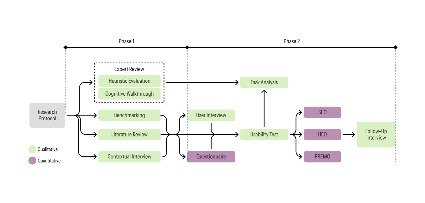
We conducted strategic research to generate evidence-based insights for redesigning the Smart TV ecosystem. First mapping the current market and existing systems, then diving into user behaviours, goals, and expectations around the game room experience.
Initial Evaluation
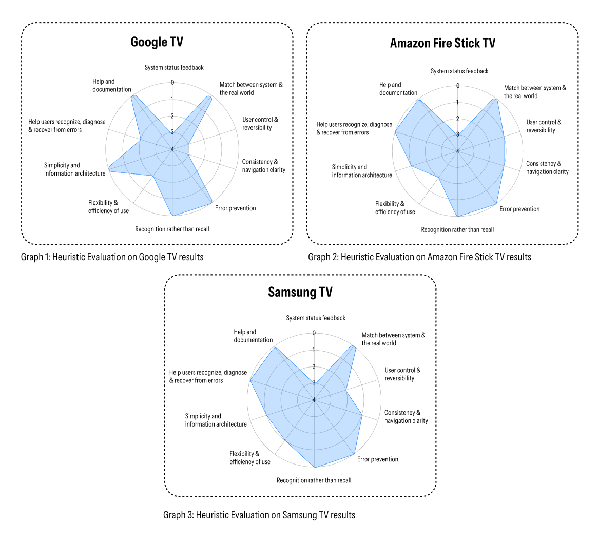
Heuristic evaluations were conducted by the research team to identify systemic interface drawbacks and initial pain points across three Smart TV interfaces. Evaluations were carried out against Nielsen's 10 Usability Heuristics.
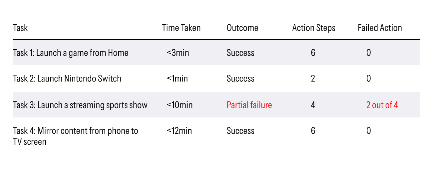
A cognitive walkthrough was conducted to assess whether a first-time user could complete core interactions using only what the interface communicated. The findings documented successes and failures to identify specific friction points.
Usability Testing
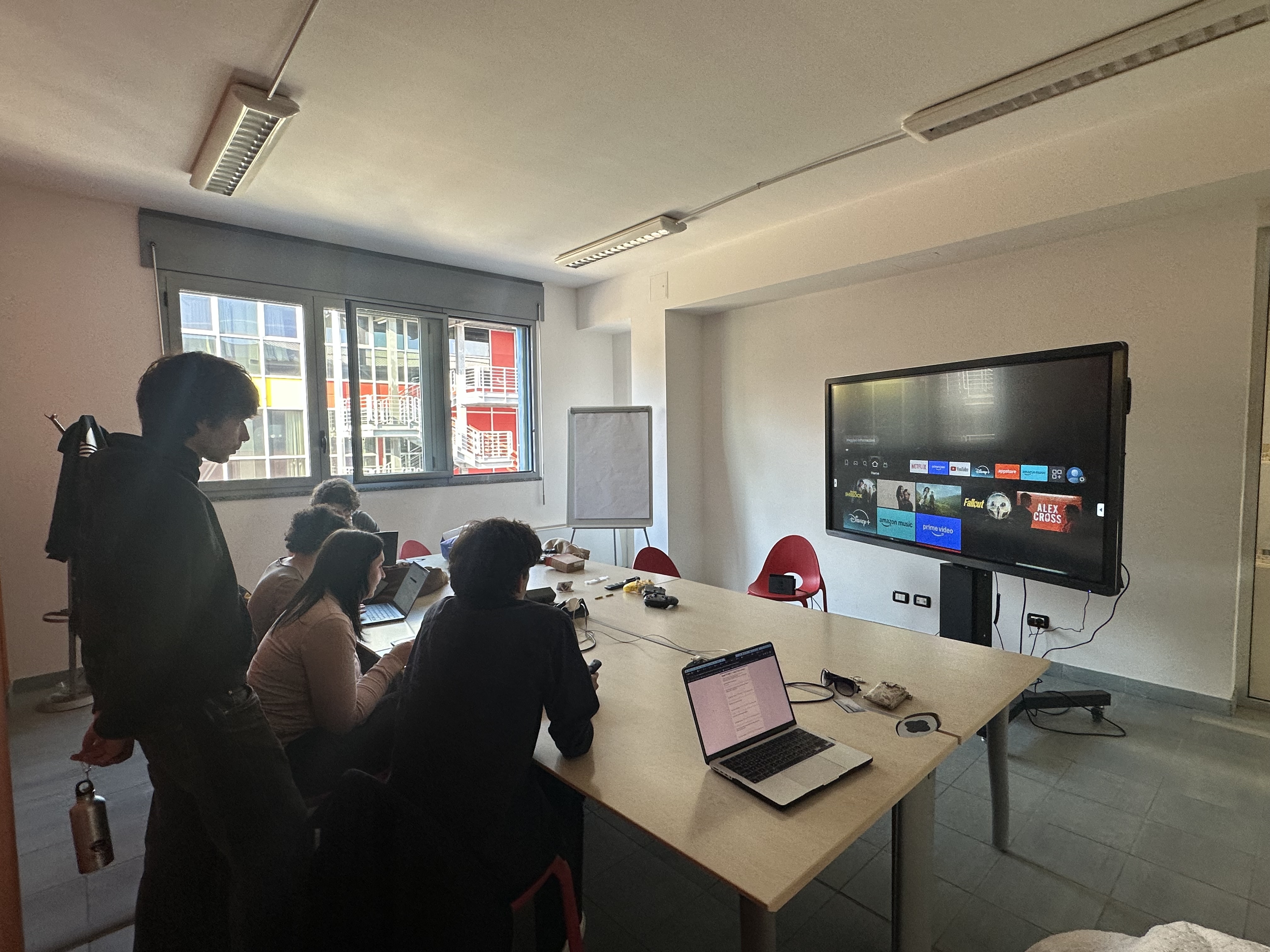
Usability testing was conducted to evaluate how real users interact with the existing Smart TV interfaces, identifying where the system causes friction, confusion, or task failure.
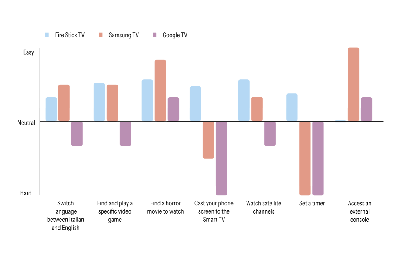
Single Ease Question
A single 7-point scale asked after each task. Measures perceived task difficulty with minimal interruption to the session flow.
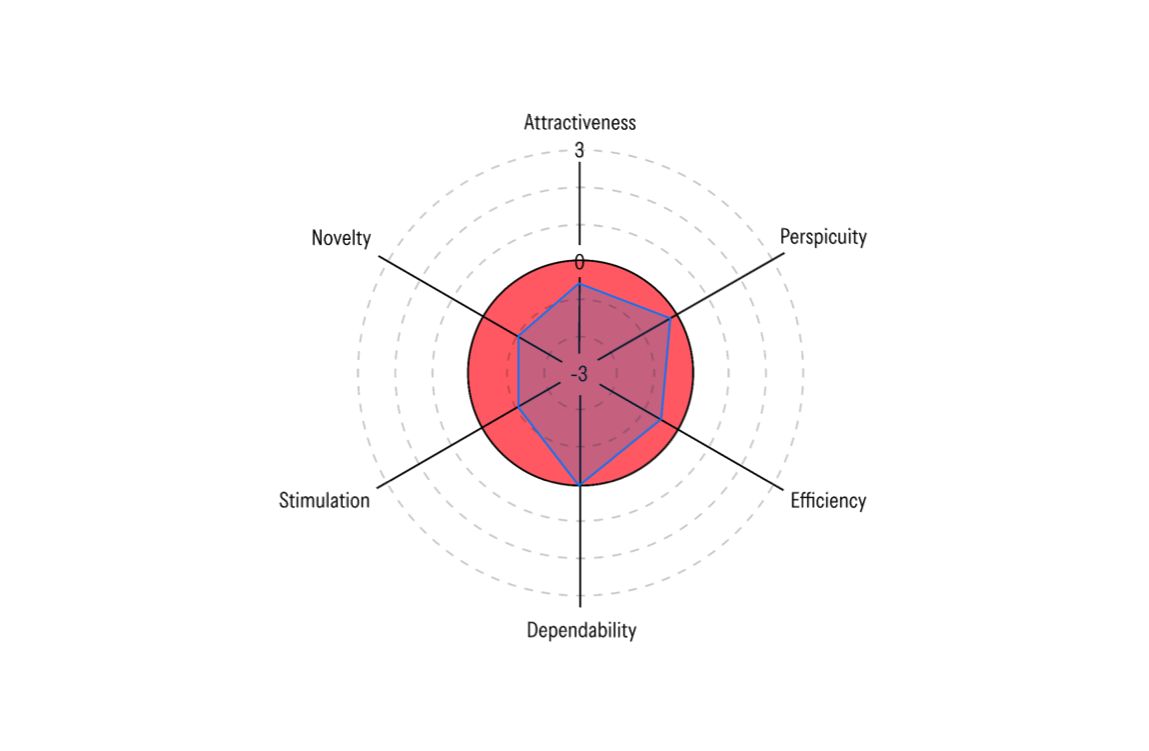
User Experience Questionnaire
A standardised scale measuring six dimensions: attractiveness, perspicuity, efficiency, dependability, stimulation, and novelty.
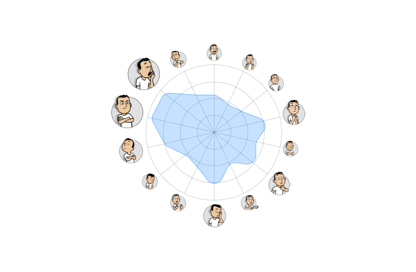
Product Emotion Measurement
An animated character-based tool that captures emotional responses to a product, surfacing feelings users may struggle to put into words.
The Social Explorer
Marco is a 22-year-old gamer seeking social interaction, eager to experience a game room with friends for a fun, social night out.
- ●Digitally fluent
- ●Fast learner
- ●Sees TVs as passive screens
- ●Overloaded interfaces
- ●Unintuitive remotes
- ●Setup delays
- ●Shared experience
- ●Instant set-up
- ●Inclusion
The current Smart TV ecosystem is not designed for group use. Interaction is intended for a single user at a time, with the remote control continuing to be presented as the standard interaction tool.
The Smart TVs currently used in gaming rooms are standard consumer products, featuring conventional interfaces and remote controls that do not contribute to a distinctive experience.
Current Smart TV interfaces often require effortful navigation, failing to reflect the expected level of immersion and comfortable, lean-back experience.
Current Smart TV interfaces are overloaded with information, which slows down content discovery and reduces user satisfaction during interaction.
Current Smart TV navigation is largely based on linear scrolling and multi-step menus to switch between different activities (e.g., games, media), which slows down transitions and disrupts the momentum of shared sessions.
Bloated interfaces, irrelevant content suggestions, and confusing navigation on Smart TV interfaces make the game room experience feel inefficient and time-consuming. These reduce what should be a purpose-built social space to nothing more than an ordinary living room setup.
The Smart TV will act as a core social asset, transforming the game room into a purpose-built destination experience. It will feature unified navigation and relevant content to eliminate friction and technical delays during social play.
Shared Experience
The system must accommodate parallel, simultaneous interaction from multiple users, granting individual agency to foster engagement, perceived fairness, and a feeling of active participation.
Ambient Immersion
The experience should reflect the immersive energy of a professional game room environment, distinguishing it from standard consumer-grade Smart TV.
Maximise Comfort
The interface of the TV should address the mental model of lean-back interaction, offering a straightforward, cohesive and effortless experience, even for first time users.
Reduced Cognitive Load
The system should organise content and functions around the group's social activity intent, minimising cognitive overload and removing irrelevant content from the user's path.
Seamless Transitioning
The system must facilitate intuitive, instantaneous shifts between different activities to maintain momentum during a session, eliminating technical pauses that disrupt group energy.
UI/UX Design
With research insights and design requirements in hand, we are now moving on to design the experience.
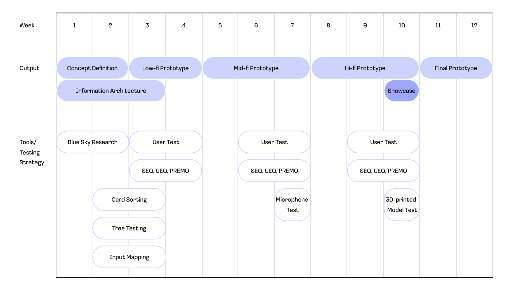
From concept to final prototype in 12 weeks, we iterated through lo-fi, mid-fi, and hi-fi prototypes with user testing at every stage.
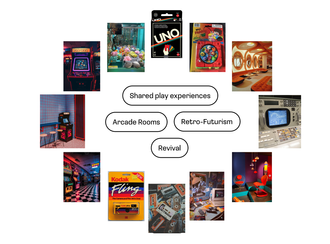
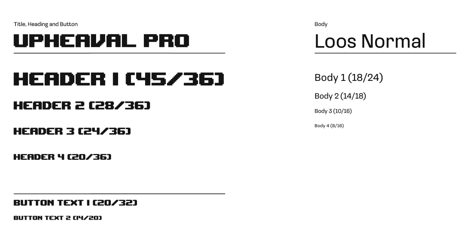
Bluesky Research were conducted to collect inspirations from external fields and disciplines. Arcade rooms and retro-futurism were selected due to their strong association with shared entertainment spaces and their distinctive hybrid visual language.
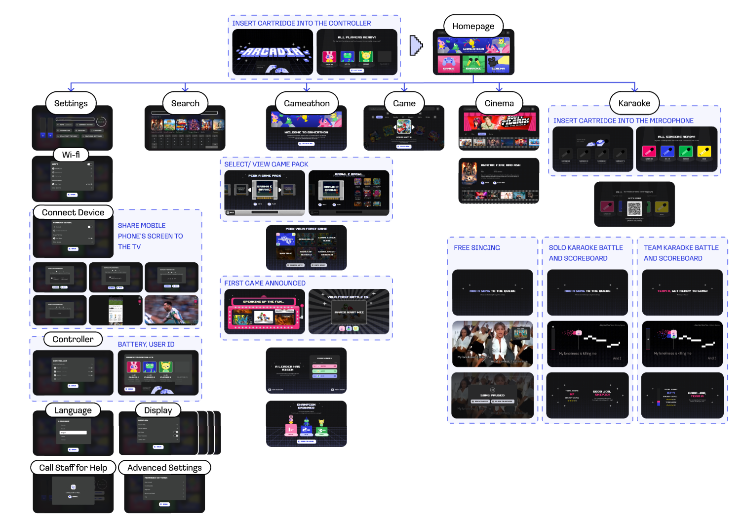
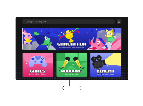
This Smart TV interface centers on group momentum to reignite the thrill of competing together, offering a gaming experience that users cannot replicate at home.
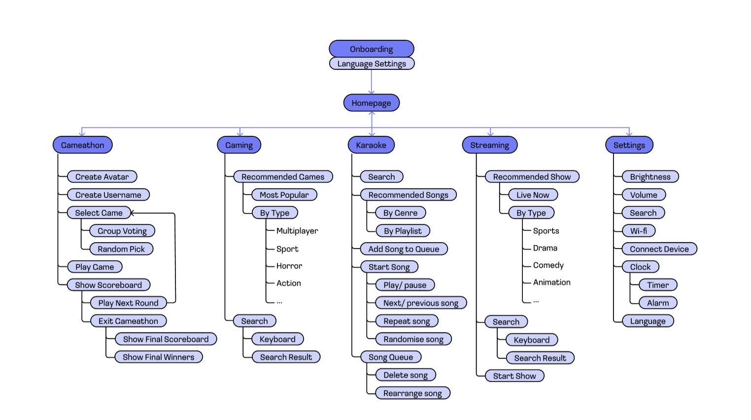
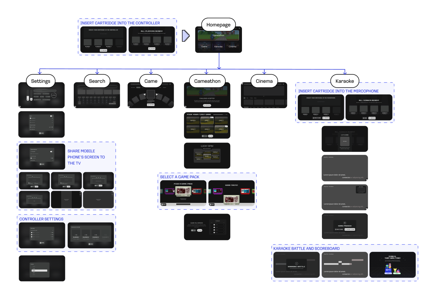
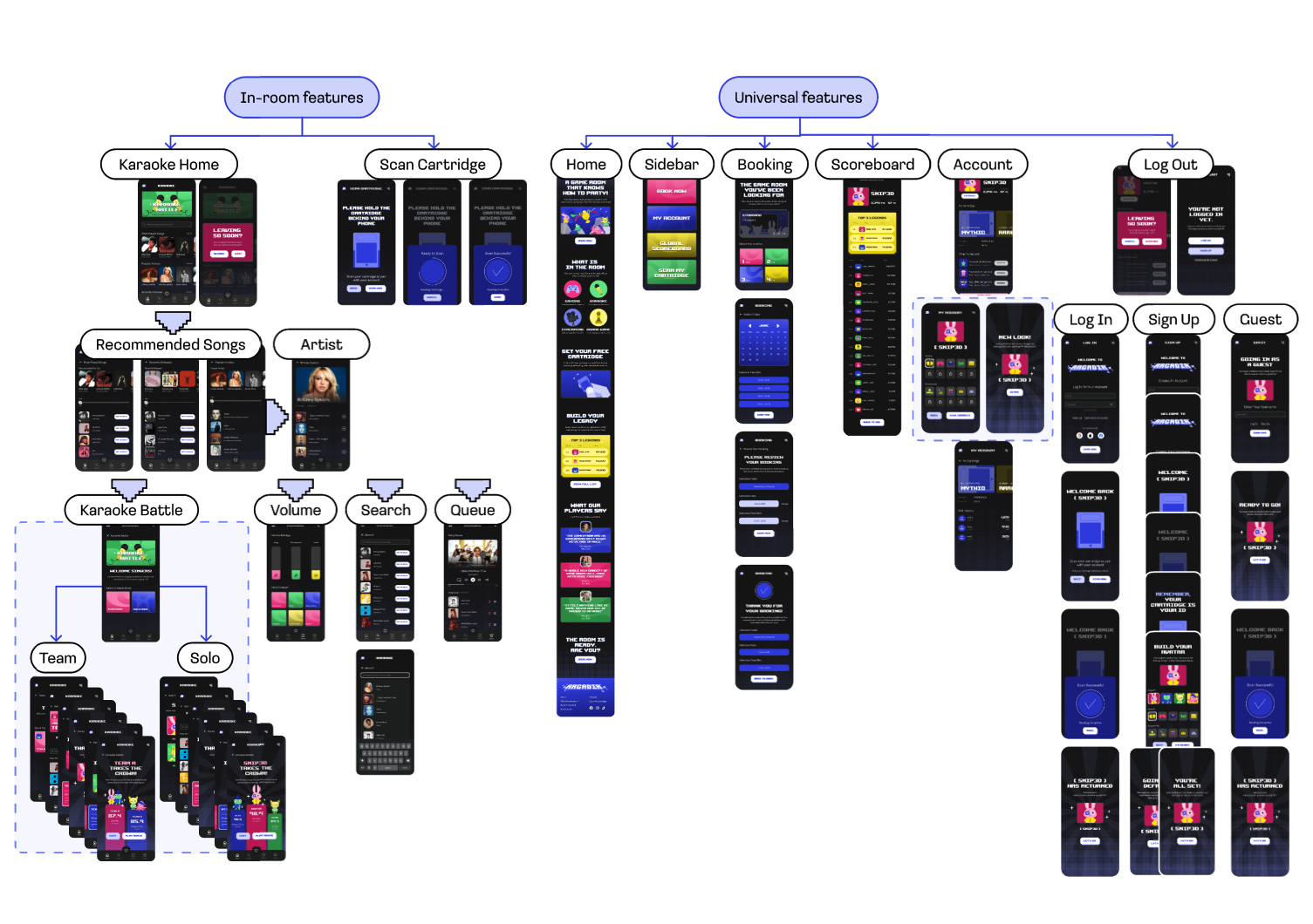
Information Architecture is the structural blueprint of the system, defining how content and features are organised and navigated. We validated it through Card Sorting and Tree Testing to ensure it matched the users' mental model.
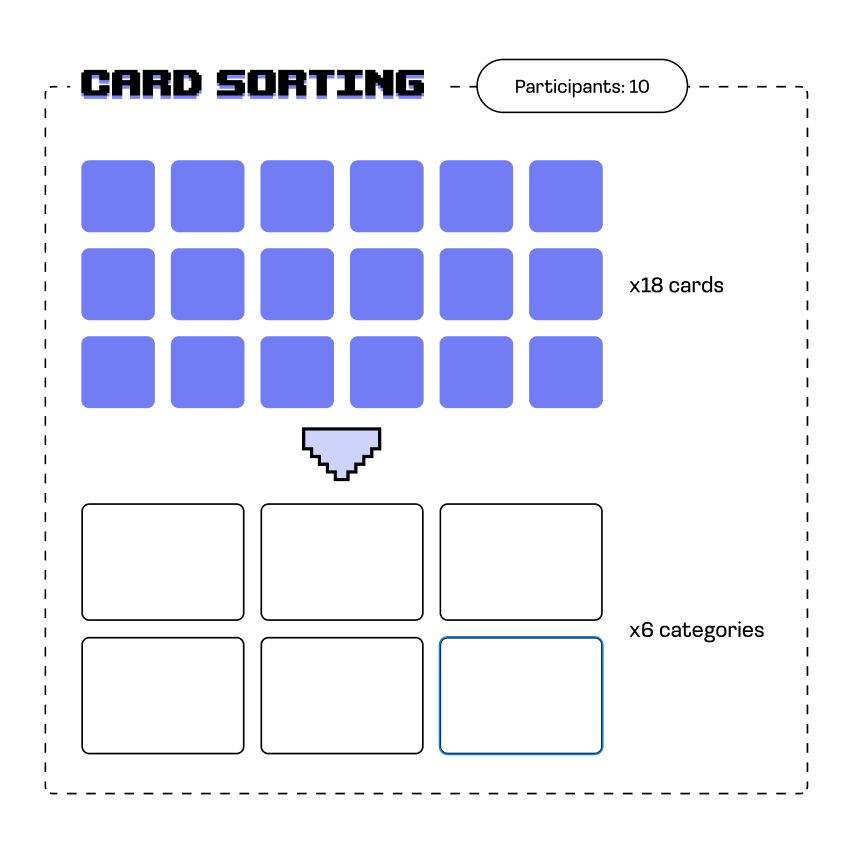
Open Card Sorting asked users to group content labels into categories according to their own logics. This allowed us to observe where they would expect to find specific features within the system.
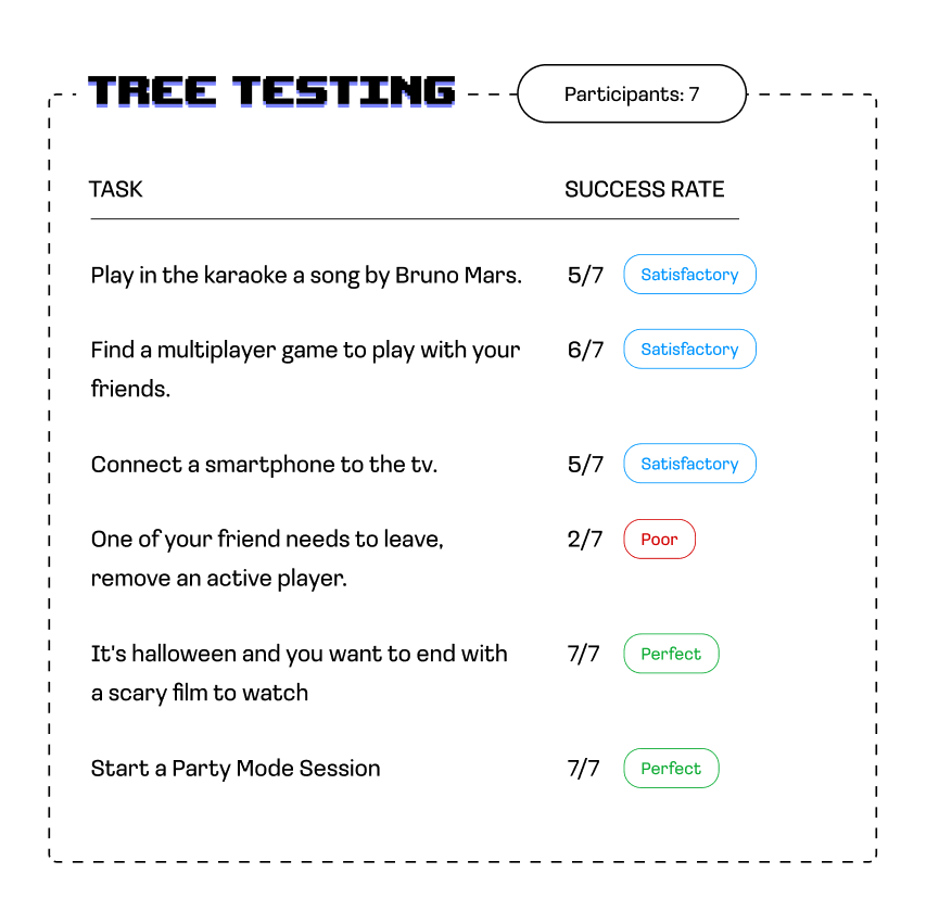
During Tree Testing, users were asked to identify the correct path to locate the requested information. This allowed us to validate that the proposed structure was user-centred before moving on to wireframing.
Lo-fi Prototype Testing
Each participant was presented with the lo-fi prototype (TV and tablet) and asked to complete a set of tasks. This helped us understand whether it supports the core behaviours a game room demands.
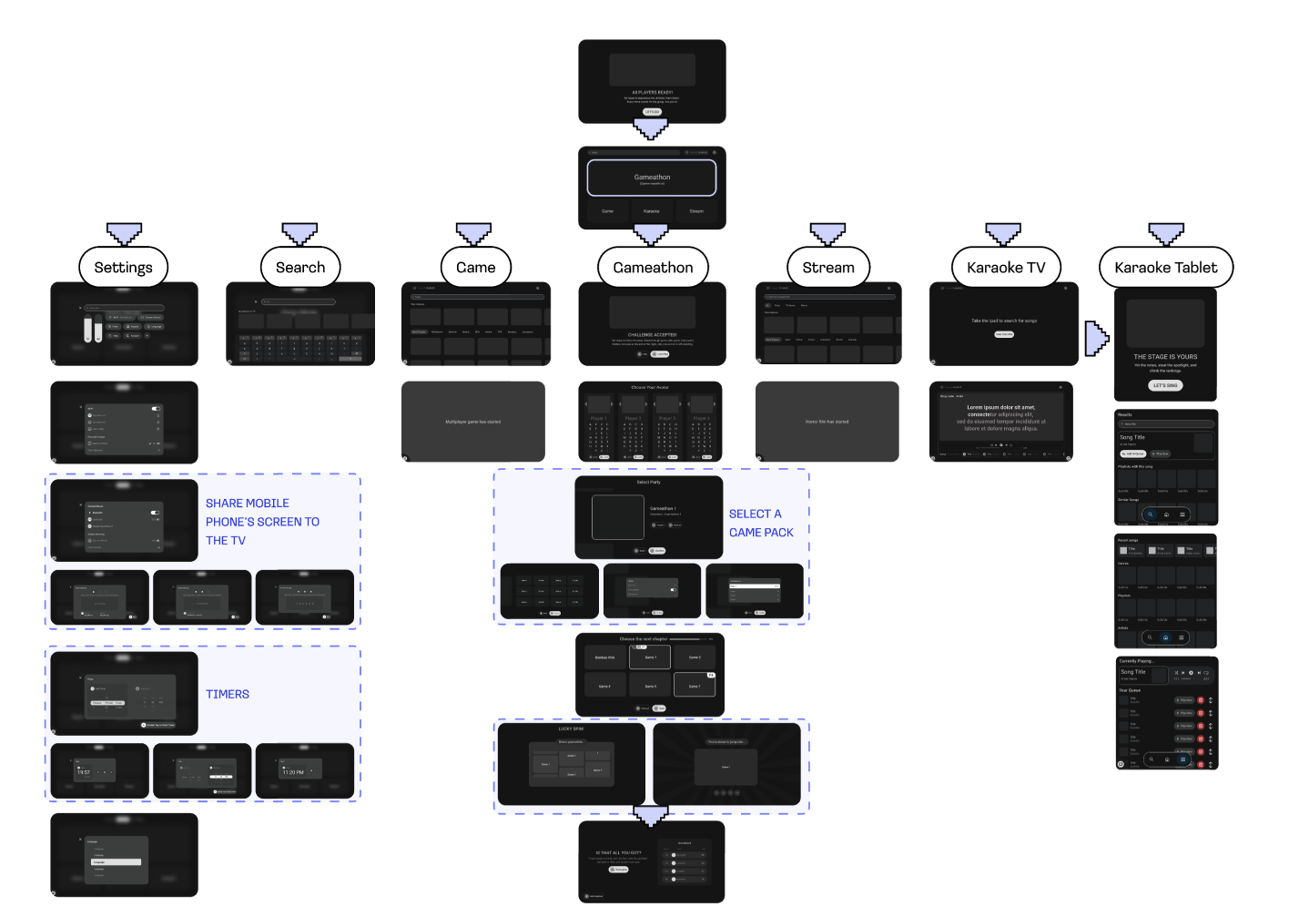
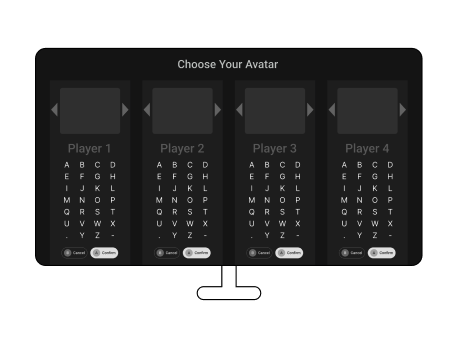
Onboarding on TV caused friction
The onboarding process was too long for a time-sensitive experience. Too much time is spent entering information and customizing.
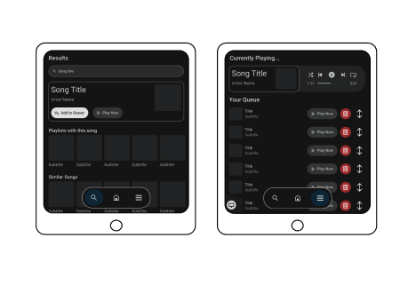
Tablet karaoke were unclear
In the karaoke section, the queue list and recommendations felt unclear, and "Add to queue" should trigger on song click, not as a separate step.
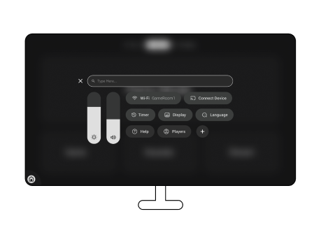
Settings need to be redefined
In settings, Help and Player didn't really fit, while the Timer was important enough to deserve a place at the top, without a subsection.
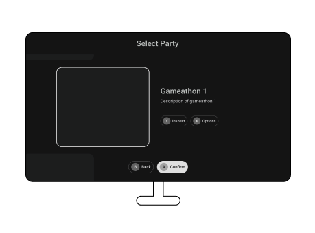
Select game pack overload
In the gameathon, too many actions were packed onto one screen. The pack selection overloaded users and needed to be redistributed more linearly.
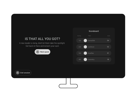
Build excitement
Users also suggested a build-up through transitions and animations for the scoreboards to anticipate excitement.
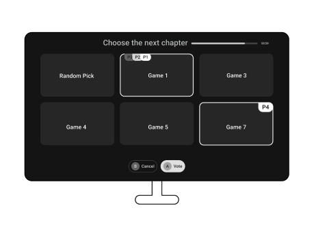
Ambiguous language
Ambiguous language choices were unclear in the functional text.
Added Touchpoints
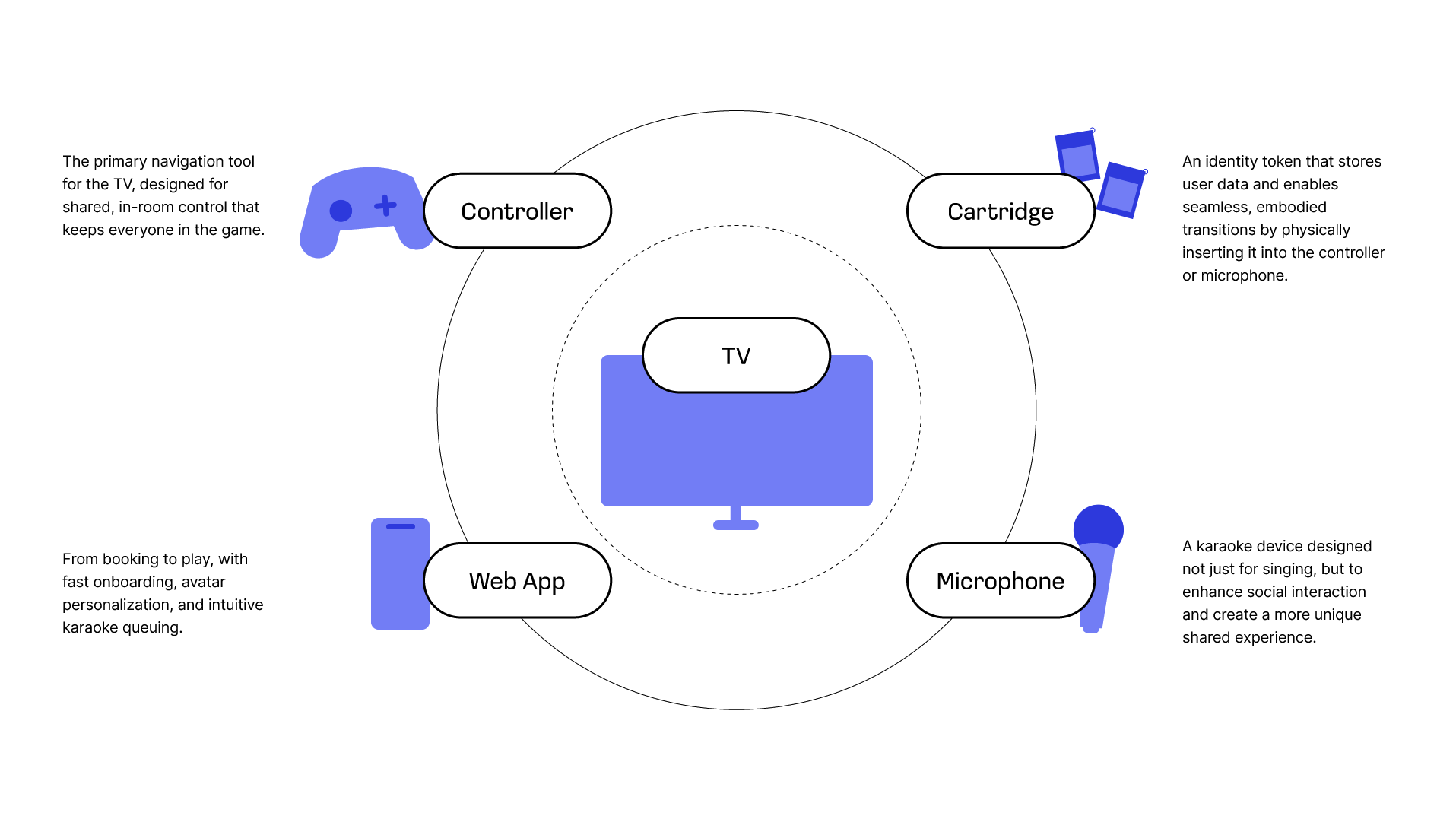
To create a truly shared experience, we expanded beyond the TV screen. By introducing four interconnected touchpoints, our solution became an ecosystem that turns a regular game room visit into something worth coming back for.
Mid-fi Prototype Testing
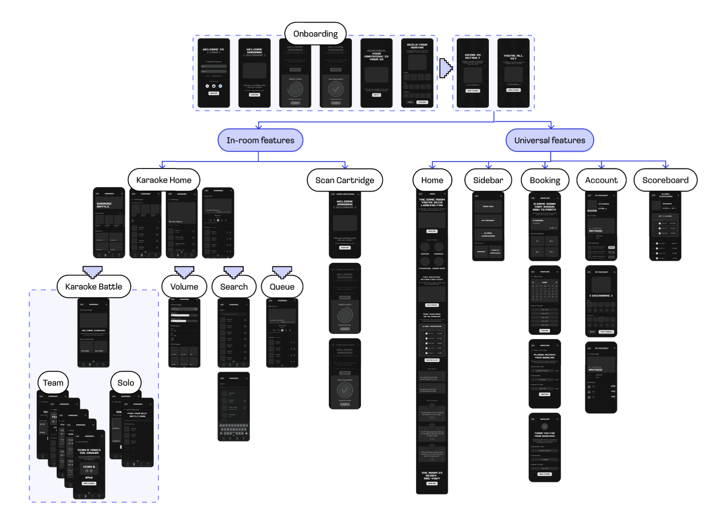
Each user was presented with the mid-fi web app prototype alongside the TV interface, and asked to complete a set of tasks. This is to understand whether the mid-fi prototype successfully supports the cross-device phone-to-TV karaoke experience.
Guest login to skip onboarding
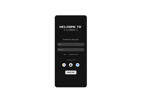
Users suggested option of guest login for those who just want to play without a full account.
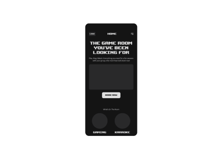
Homepage needs to be redefined
Users were expecting the homepage to be more functional rather than informational.
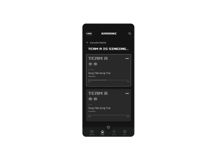
Clearer turn communication
A clearer way to show who's singing during the karaoke battle.
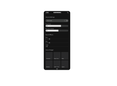
Volume settings were confusing
Too many types of buttons in one page confused the users.
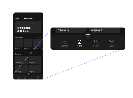
Rearrange the bottom tab icons
Rearrange the tab icons so it's more aligned with user's mental model.
Hi-fi Prototype Testing
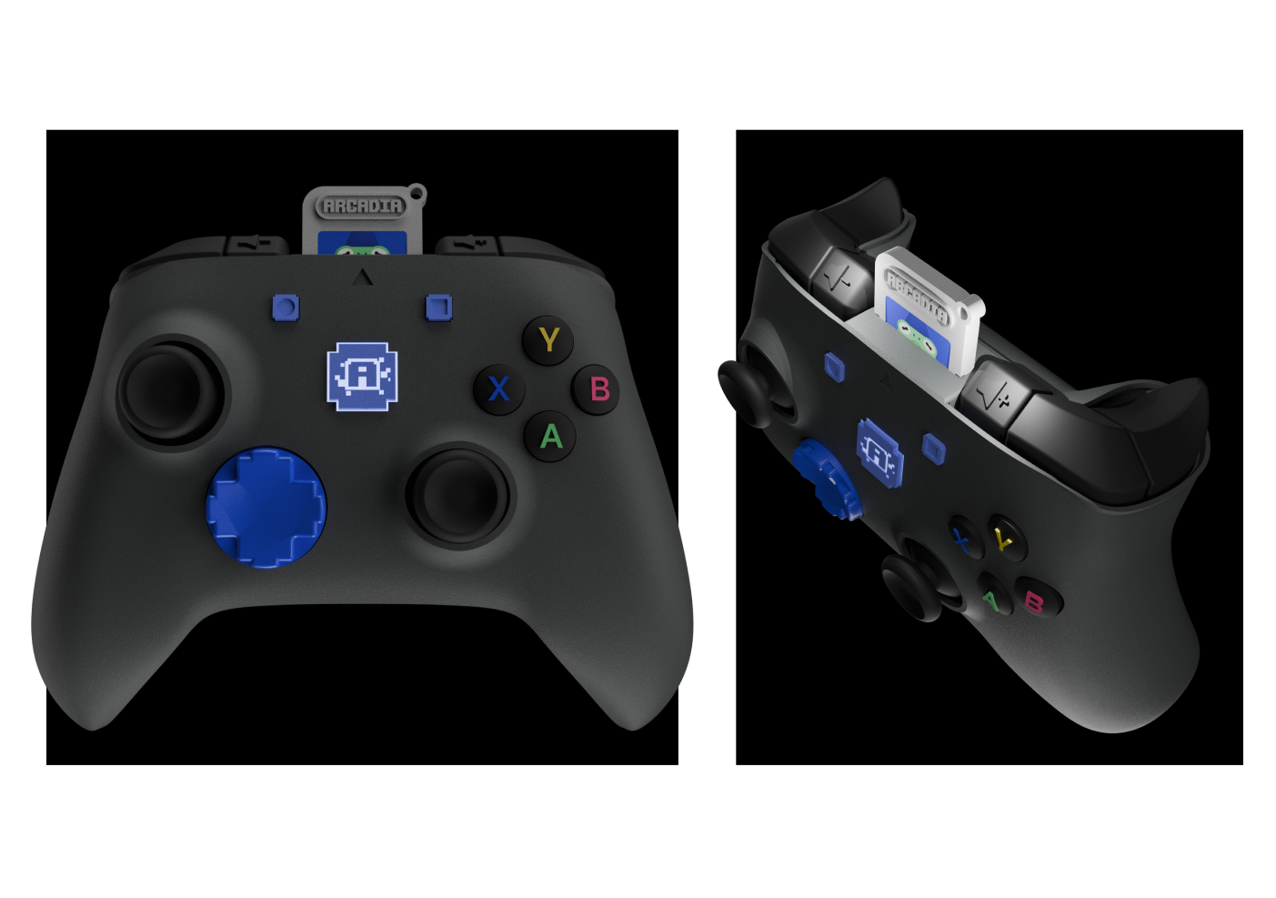
Users navigated the interface using an 8BitDo controller equipped with our cartridge attachment. This test was simulated as close to a real game room experience as possible across all touchpoints simultaneously (TV, WebApp, controller, microphone, cartridge).
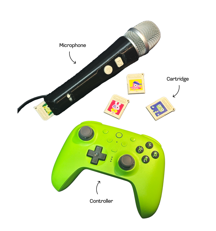
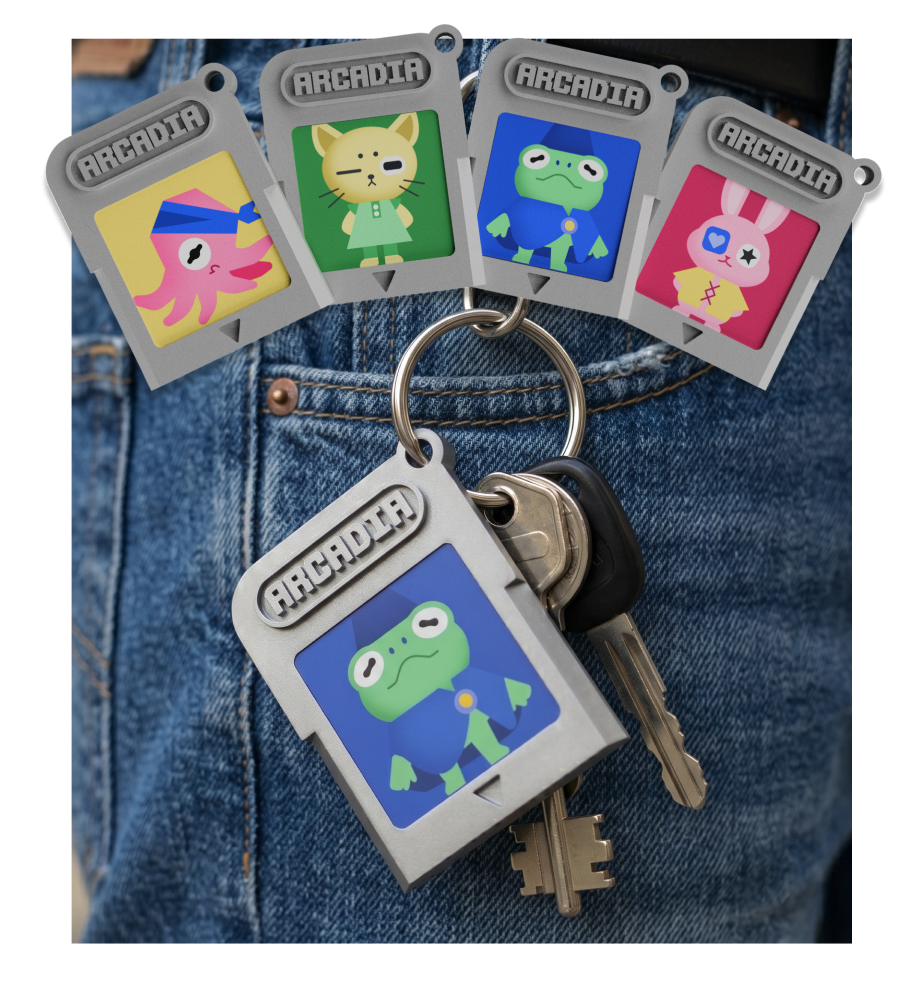
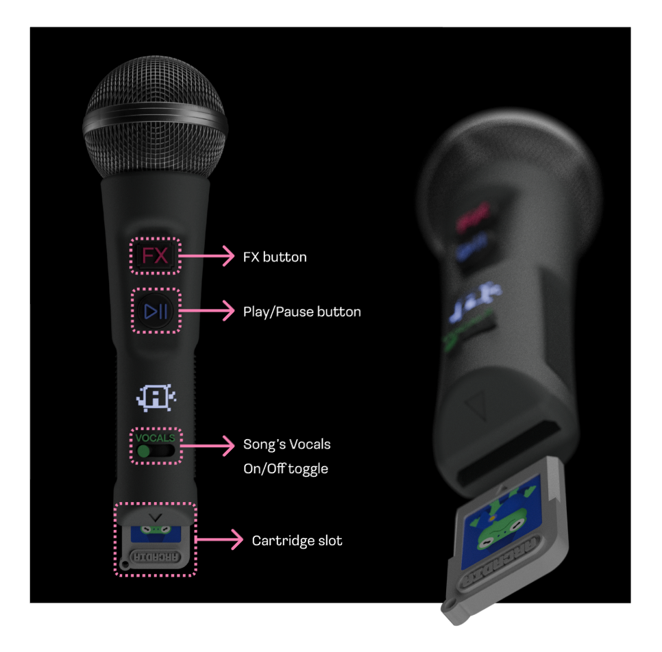
Our physical prototypes were built and ready for showcase testing: a controller, a microphone, and physical cartridges that users could hold, interact with, and respond to in real time.
Showcase
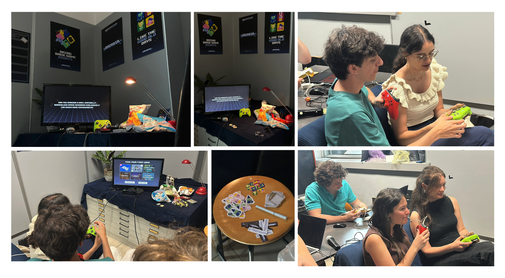
Most of the users came in small groups during the Showcase, just like how it is in the actual game room. In this evaluation, we sought to determine how effectively the ecosystem balances individual control with collective coordination.
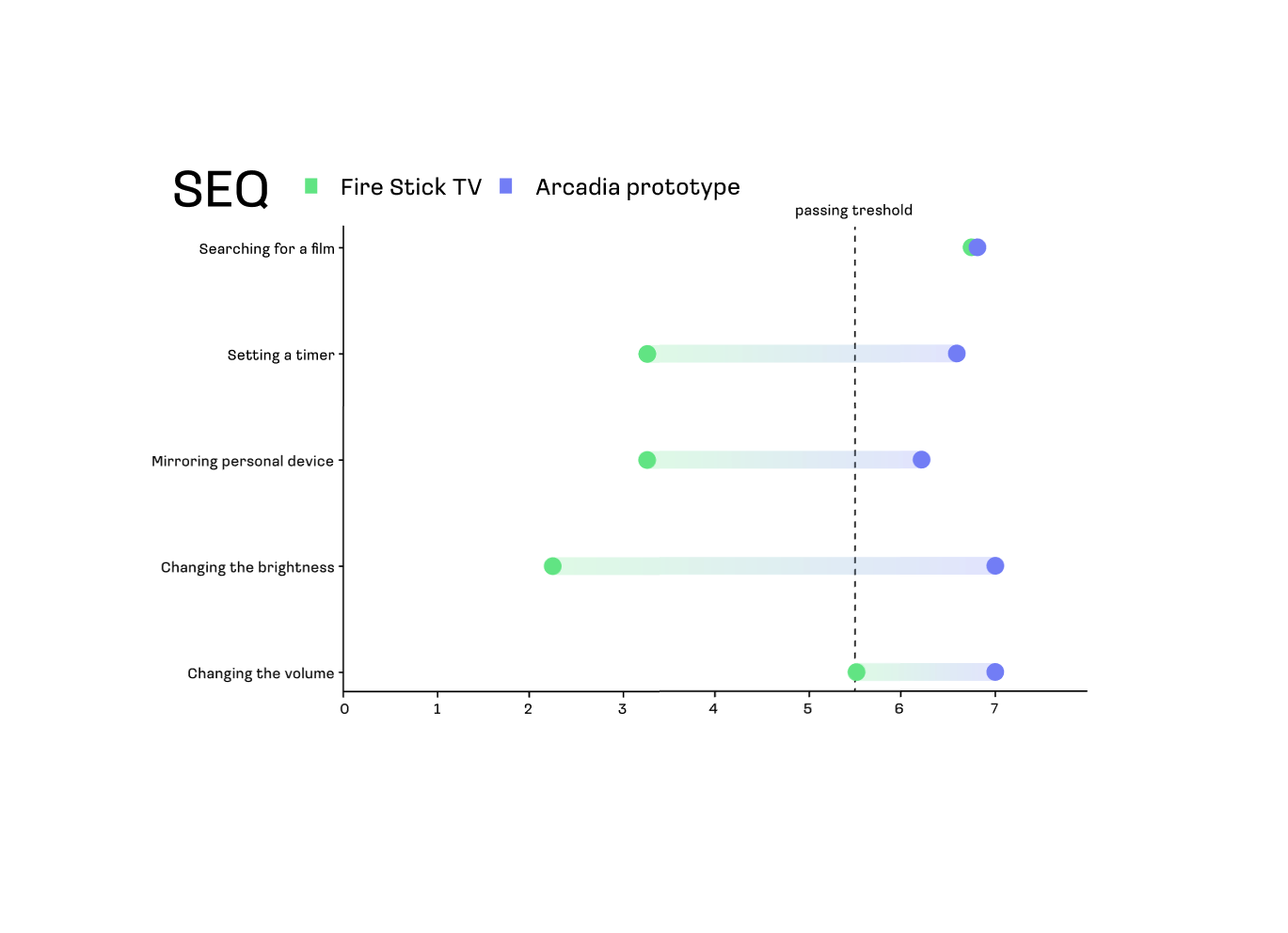
Single Ease Question
A single 7-point scale asked after each task. Measures perceived task difficulty with minimal interruption to the session flow.
User Experience Questionnaire
A standardised scale measuring six dimensions: attractiveness, perspicuity, efficiency, dependability, stimulation, and novelty.
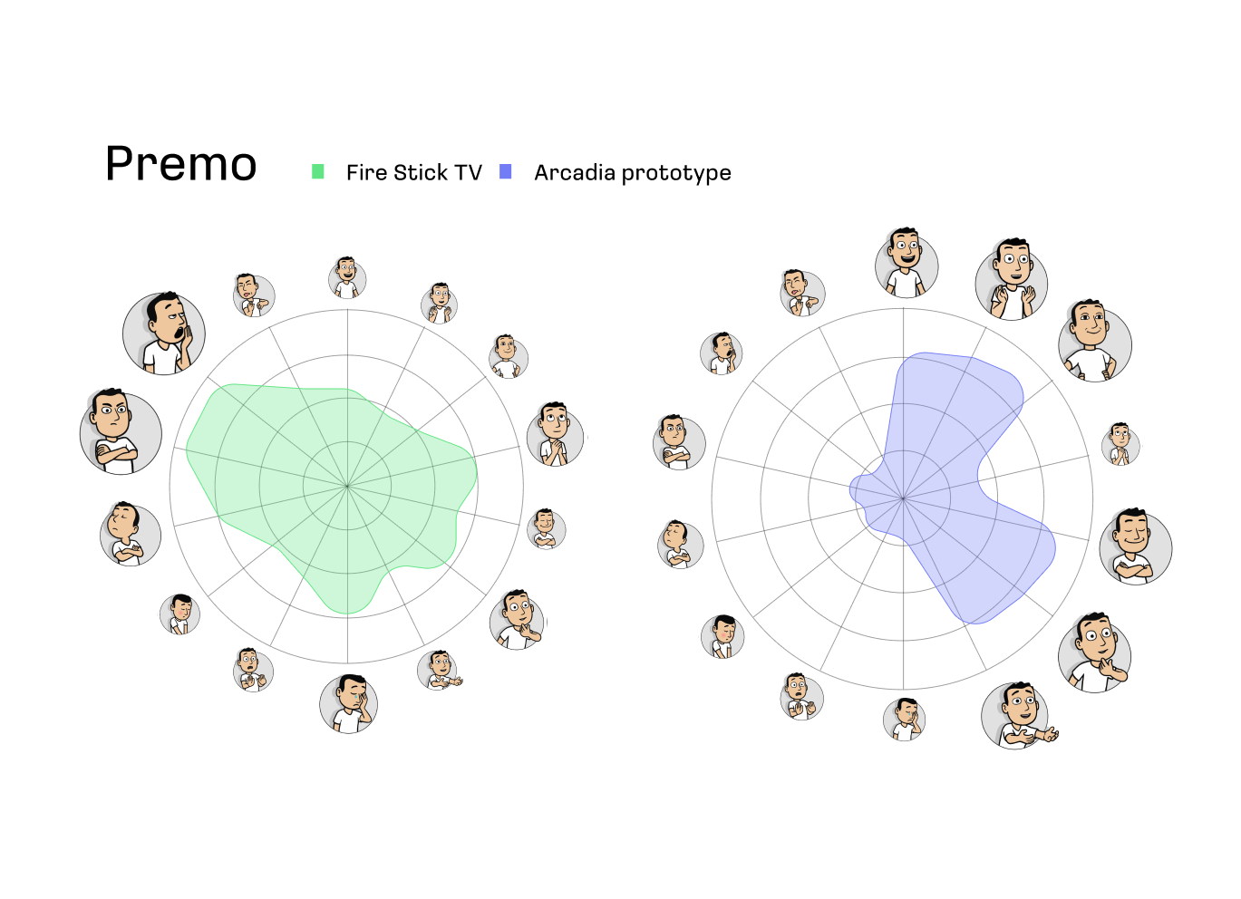
Product Emotion Measurement
An animated character-based tool that captures emotional responses to a product, surfacing feelings users may struggle to put into words.
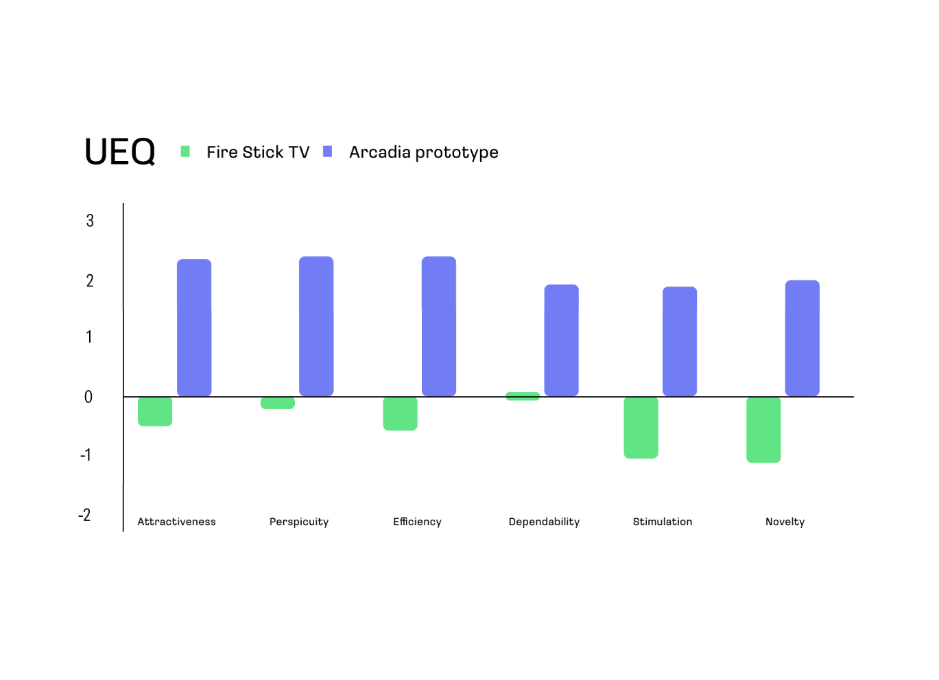
UEQ — Arcadia scored positively across all six dimensions, all sitting around +2 to +2.5, compared to the other TVs.
SEQ — Arcadia outperformed the other TV on all five tasks. All tasks appear to meet or exceed the passing threshold.
PREMO — Arcadia's cluster is noticeably larger and skewed toward positive emotional expressions.
Clearer intro for gameathon
There should be a clearer explanation to differentiate gameathon from regular gaming.
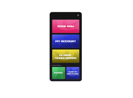
Separate in-room features
In-room features should be accessible only in the game room.
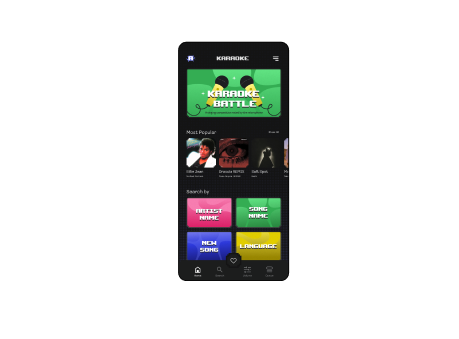
Search category was confusing
Search song by category wasn't really aligned with users' mental model, instead they were more familiar with a single search bar like the Spotify experience.
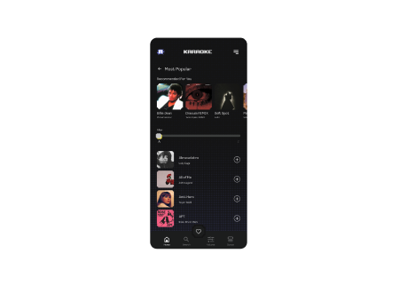
Replace the add to queue icon
Add song to queue button was too small.
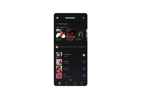
Add feedback after action
Missing feedback after adding a song.
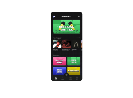
Karaoke tab wasn't obvious
The bottom tab on the karaoke page should be more prominent.
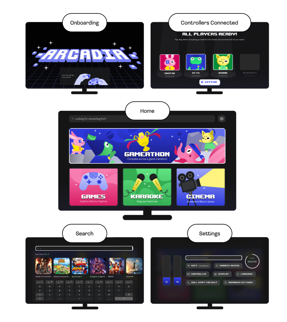
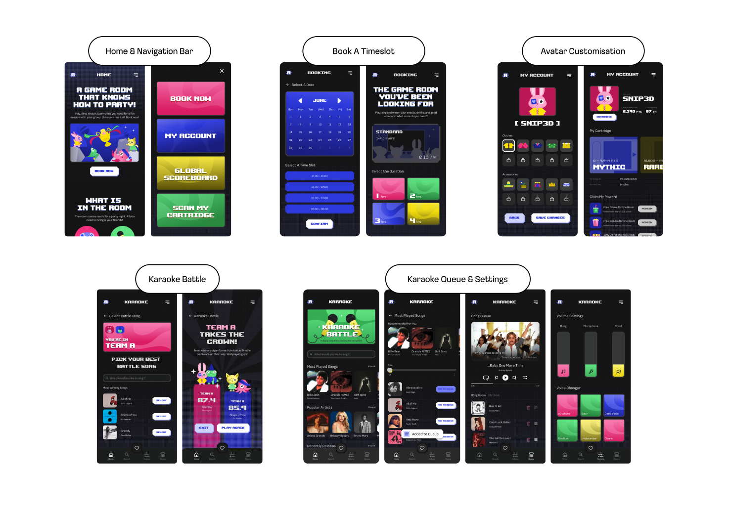
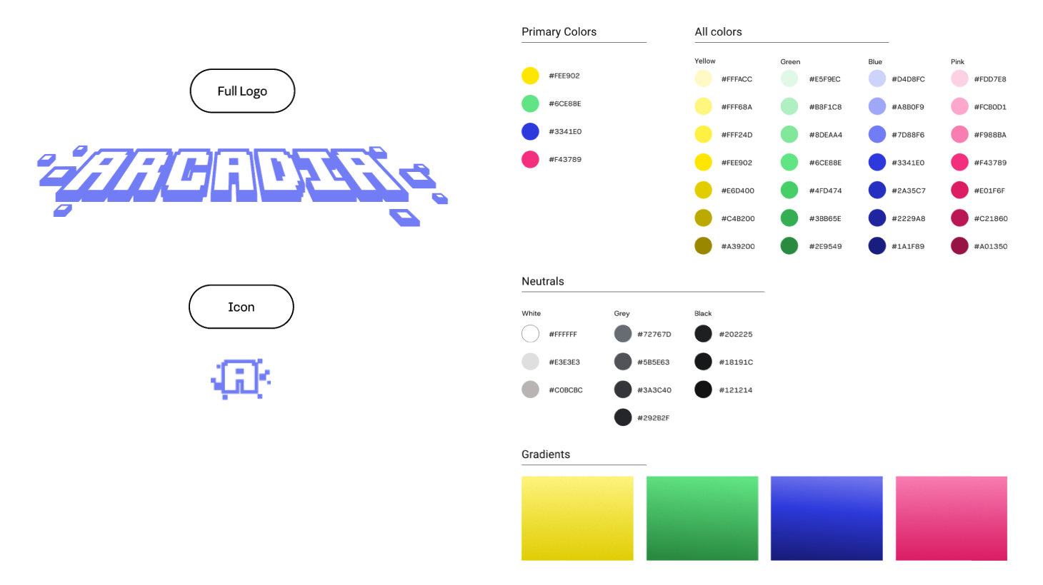
Arcadia's Final Look
Our Differentiators
Arcadia is not just better by design, it is proven. Our UX research results show measurable improvements in efficiency, satisfaction, and emotional response. Built to replicate: it turns first-timers into regulars, connects them to the Arcadia community, and gives every game room a lasting identity. Arcadia is a business model built to scale.
Users expressed no difference to gaming at home.
Arcadia introduces distinctive experiences such as Gameathon and unique Karaoke features.
Most TVs only remember what you like to watch and give recommendations.
Arcadia remembers you and your personal identity. When regulars return, Arcadia picks up exactly where they left off.
Someone always has to be the host in group play.
Let Arcadia be the host. During the Gameathon, each player can participate in a democratic vote to choose the next game together.
Information overload and frictions in switching activities.
Arcadia enables simple navigation and seamless switching between activities.
Essential features are buried in settings.
Intuitive and minimal layout, allowing users to find what they're searching for more easily.
Standard interfaces not tailored to the immersive nature of game rooms.
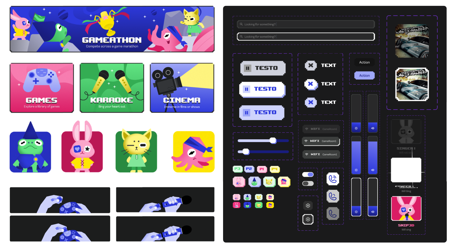
Distinctive visual identity designed to make the experience immersive and memorable.