RDA Volunteer Redesign
UI/UX
2024
National University of Singapore
Individual
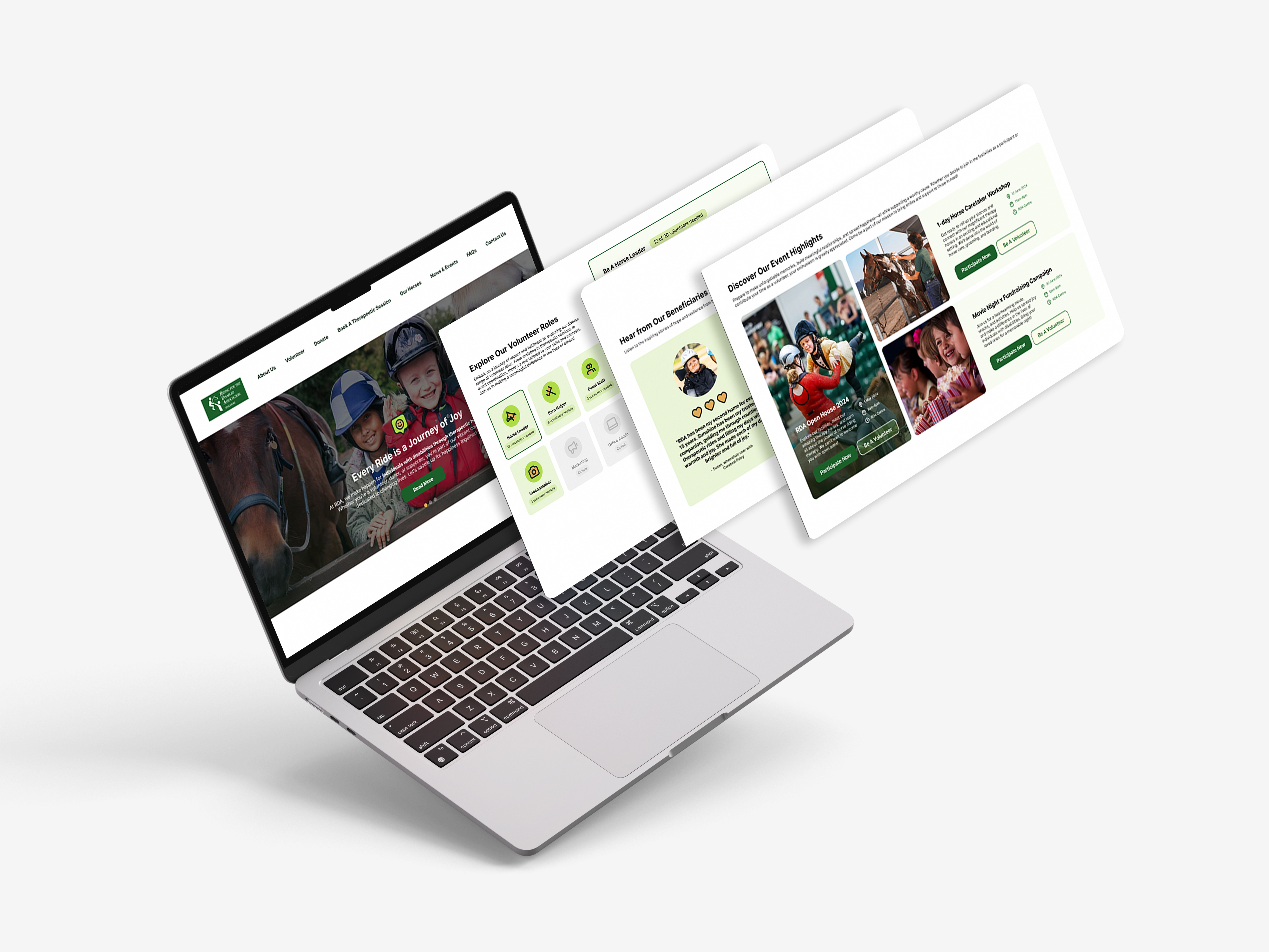
The Riding for the Disabled Association Singapore (RDA) provides life-changing equine therapy to over 7,000 beneficiaries with physical and mental disabilities. As a charity, RDA relies heavily on volunteers to keep its programs running. My goal was to streamline their volunteer registration process.
UX Research
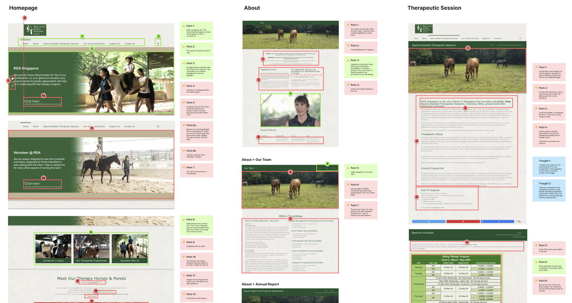
An audit of the original website's strengths and weaknesses revealed a key opportunity: streamlining the volunteer registration process to attract more participants and reduce drop-off caused by disorganised information, confusing navigation, and unclear sign-up flows.
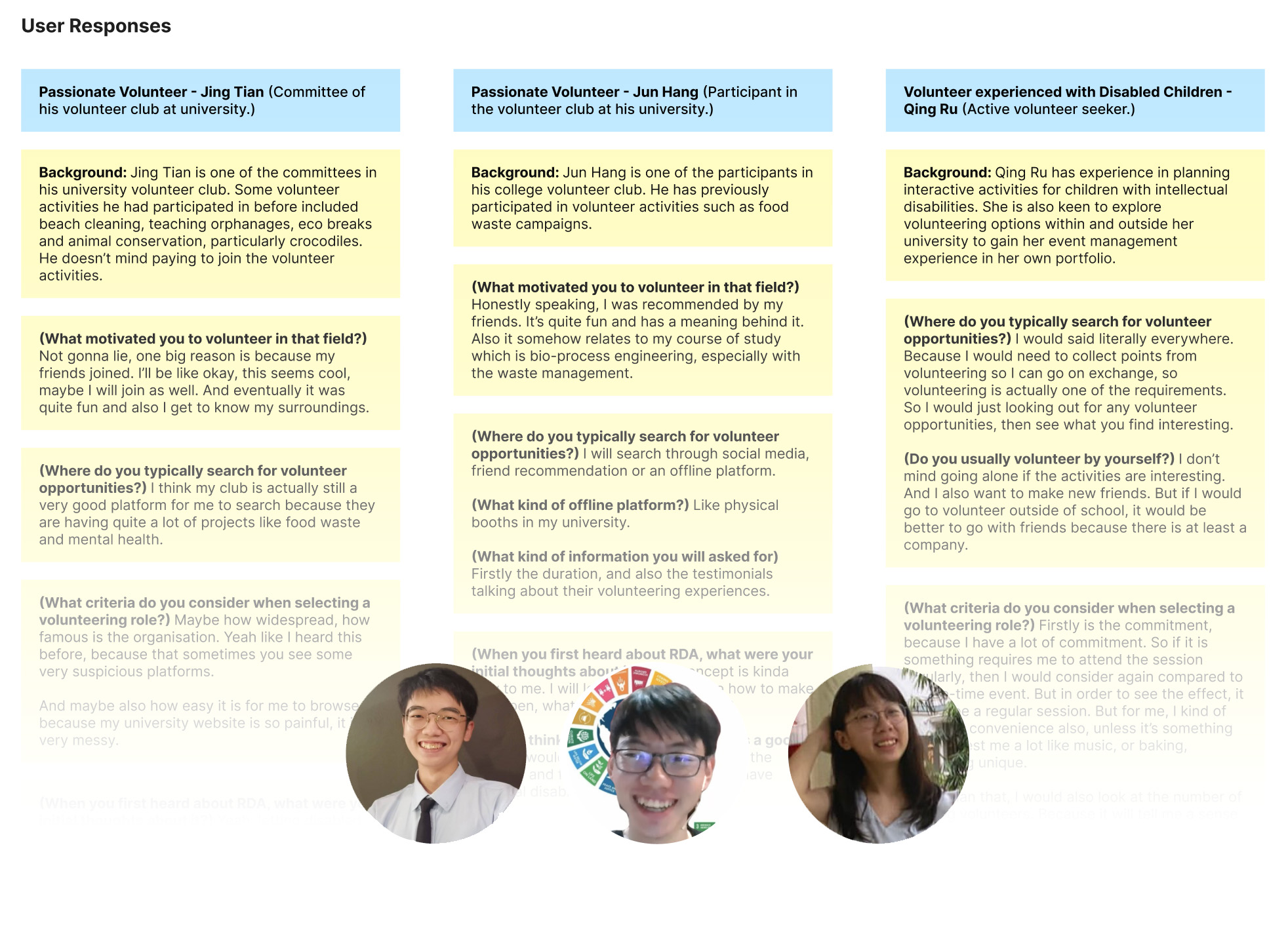
Focusing on the volunteering journey, usability testing was conducted with three regular student volunteers experiencing the original website for the first time. Their navigation was observed, and frustrations with the process were noted as they voiced them. User interviews followed to gather further qualitative responses.
“This sounds quite unique. But I'm worried about whether I have the required skills to help with these activities. Things like the requirement would be something I would look for on the website.”
— Qing Ru, student volunteerUsers seek validation before committing through reviews, volunteer numbers, or recognised certifications.
Volunteer details are scattered across multiple pages, making research time-consuming and navigation difficult.
Redirects and unclear instructions during the sign-up process frustrate users, while requests for extra information raise scepticism and unease.
Most interviewees volunteer to fulfill academic requirements or strengthen their professional portfolio.
Others are drawn by the chance to volunteer with friends or engage in activities they genuinely enjoy.
Credibility & Transparency
Because we acknowledge the pivotal role of an organisation's credibility and transparency in shaping users' perceptions and choices when considering volunteer opportunities
We propose integrating features that grant users easy access to the showcase of the organisation's reputation and trustworthiness.
Will empower users to make informed decisions by providing them with tangible indicators of the organisation's reputation and credibility within the community.
We will know this hypothesis is true if we observe an interest in click-to-view, which indicates volunteers' eagerness to assess the organisation's reputation and credibility. Positive verbal feedback about boosted confidence among volunteers correlates, leading to increased willingness to sign up.
Easy Access to Information
Because we recognise the importance of easy access to volunteering information in capturing the interest of short-term attention volunteer seekers.
We propose incorporating a feature that enables users to view all relevant information at a glance and filter volunteering opportunities based on their preferences.
Will empower users to seamlessly and quickly narrow down the volunteer activities based on their preferences and availabilities, facilitating a smoother and more efficient volunteer engagement process.
We will know this hypothesis is true if we observe a decrease in the time taken by volunteers to navigate around the website, view event details and sign up.
Seamless Sign-Up
Because we recognise the user's desire for a more seamless sign-up process, we propose streamlining the registration steps and minimising friction points.
We propose implementing a single-page registration form with intuitive design and clear instructions.
Will empower users to navigate through the sign-up process effortlessly, reducing the time and effort required to complete registration and enhancing user satisfaction.
We will know this hypothesis is true if we observe users navigate through the sign-up process effortlessly, reducing the time and effort required to complete registration and enhancing user satisfaction. Positive verbal feedback from volunteers indicated heightened interest in participating in tailored volunteer programs.
UI/UX Design
Mid-fi Prototype
Two users were presented with the mid-fi prototype on desktop and asked to complete a set of tasks. This helps to determine whether the new design supports a smooth discovery and sign-up process.
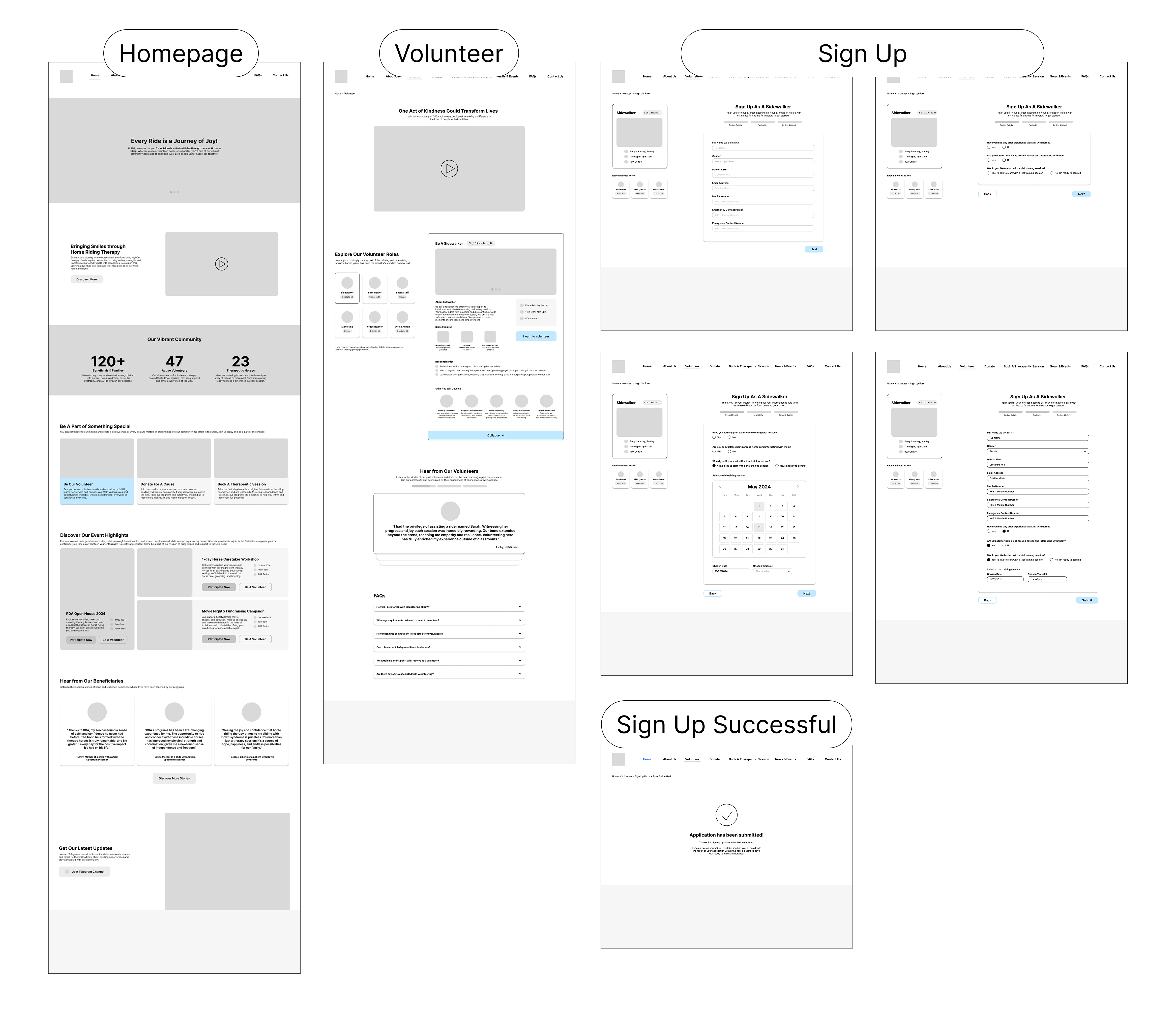
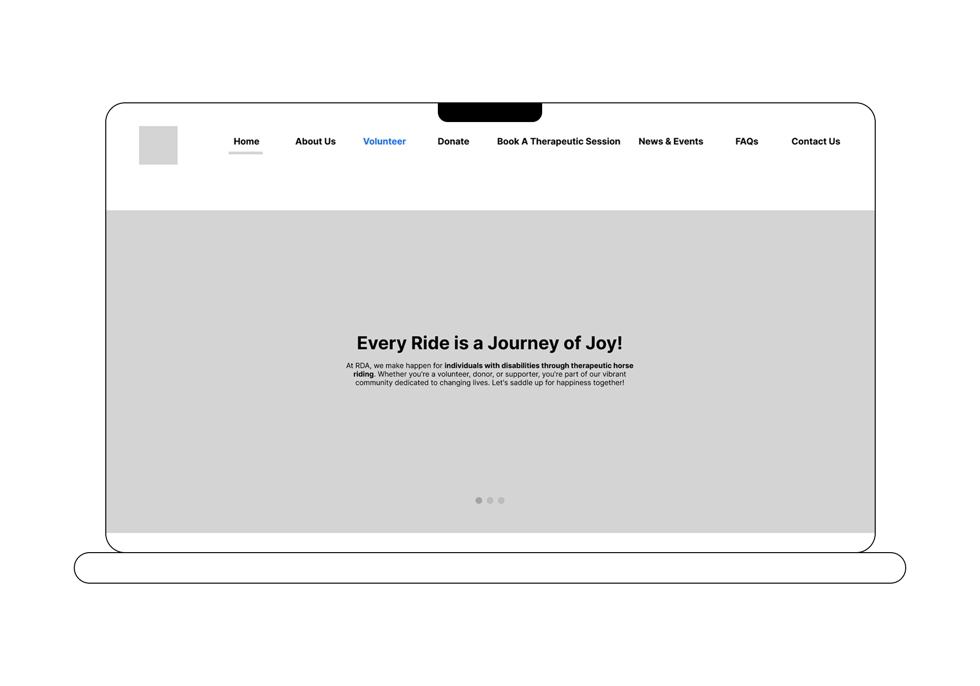
Missing Call to Action
Upcoming events should be featured in the hero section, with a Register button for a clear call-to-action.
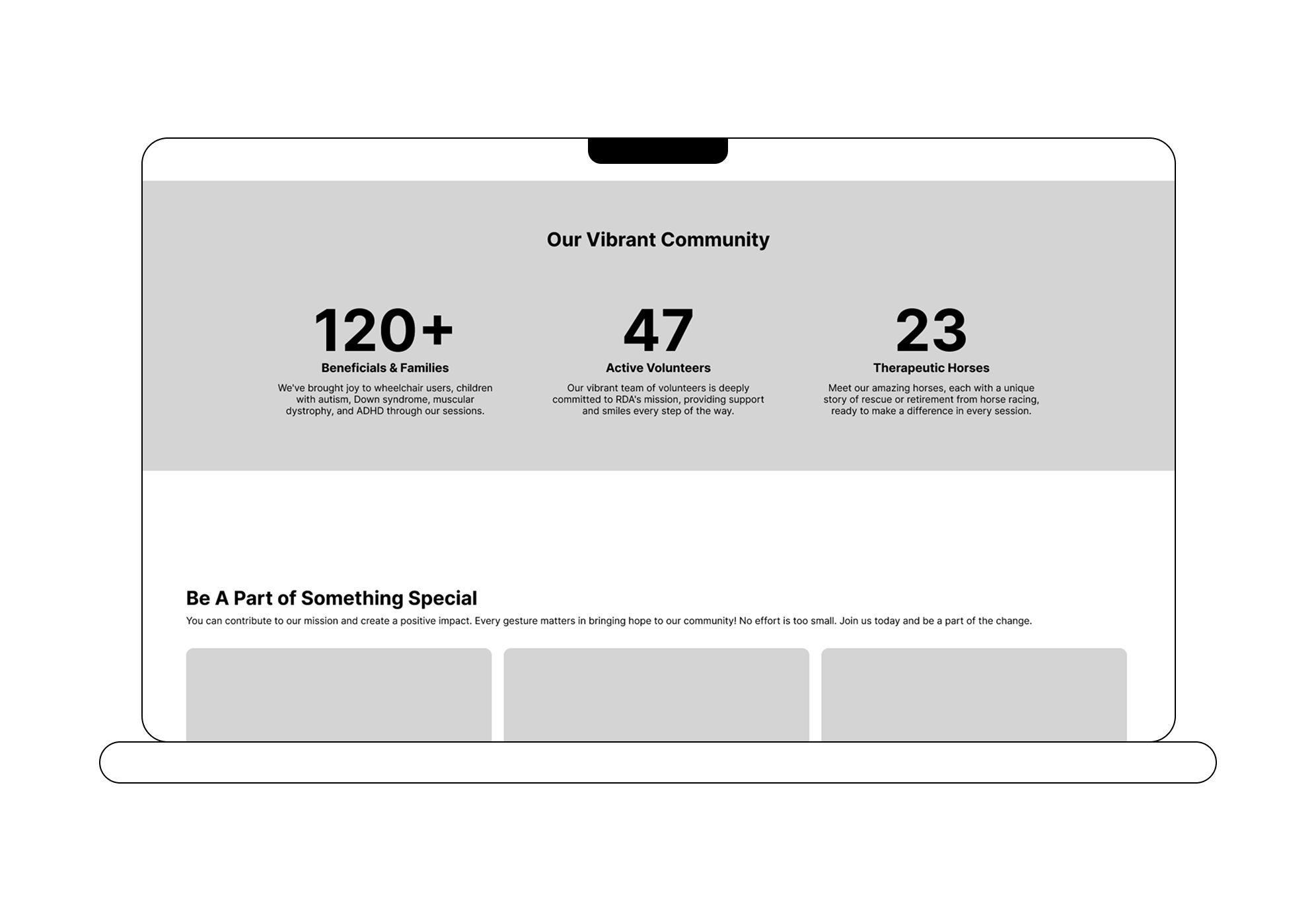
Misplaced Community Section
The "Our Vibrant Community" section should be moved below testimonials.
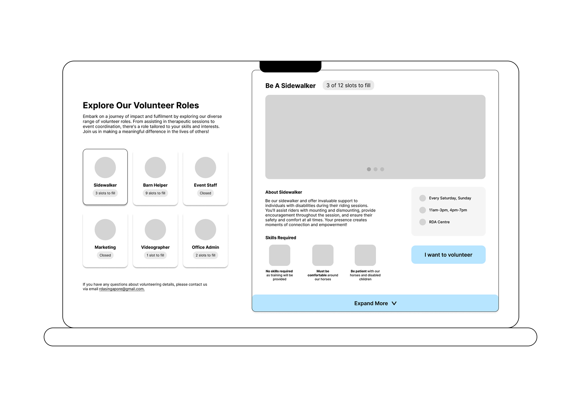
Pressuring Availability Options
Volunteer numbers needed per role should be visualised. Fixed scheduling (e.g. "Every Saturday") feels pressuring, flexible day options should be offered instead.
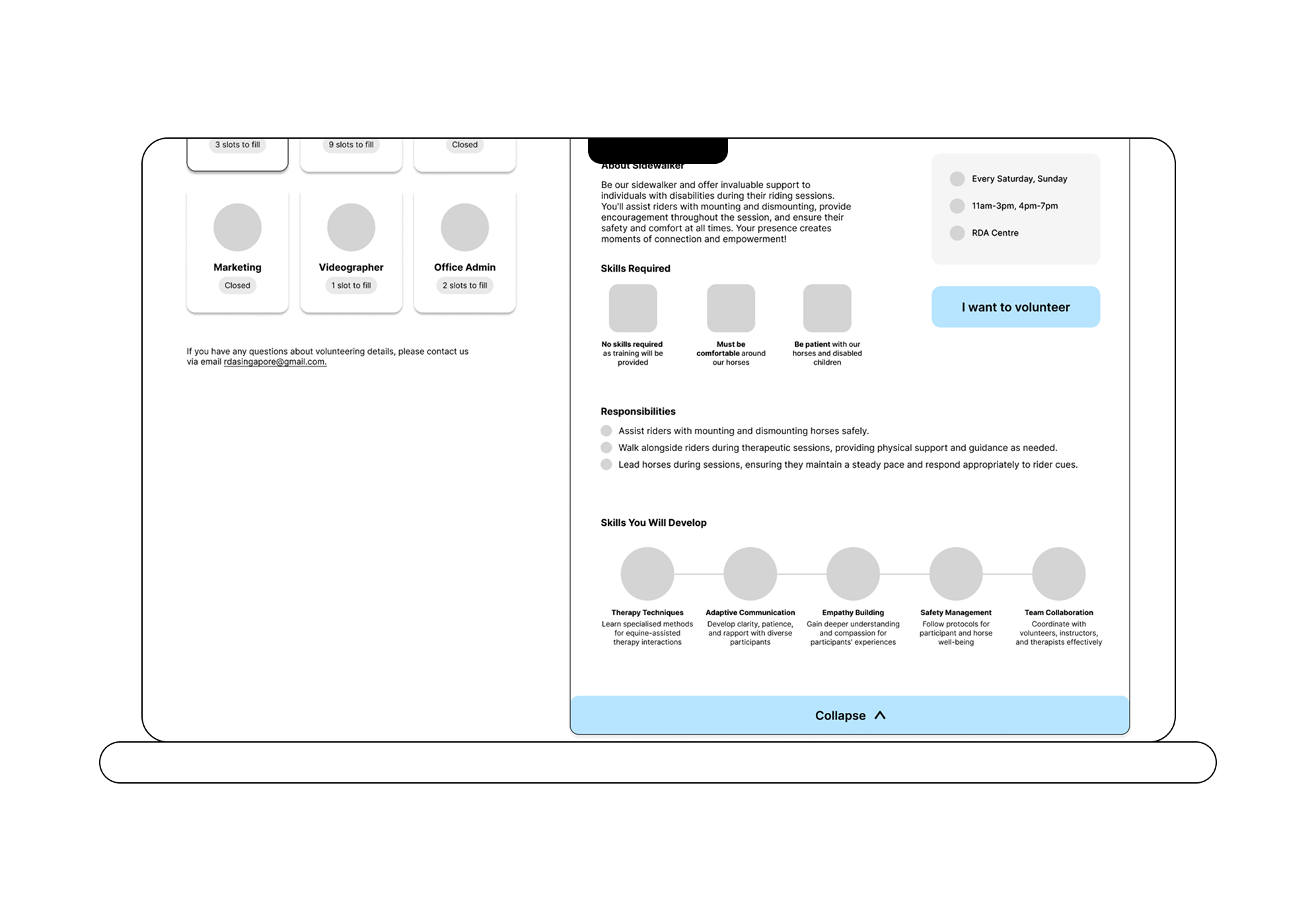
Insufficient Role Information
Even after expanding tabs, users want more detail, such as which horses they'll interact with, walking routes, and how to assist children with disabilities.
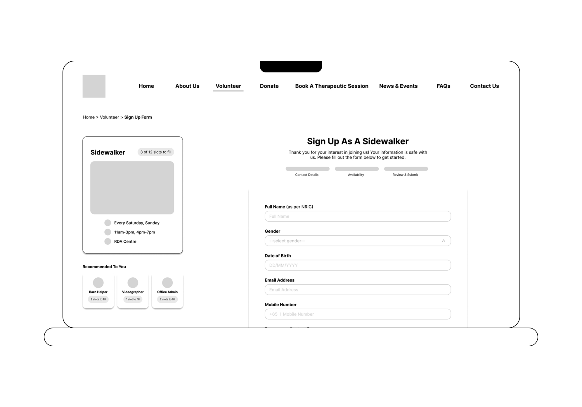
Unclear Progress Indicator
The sign-up progress bar is confusing; the user's current step should be highlighted more clearly.
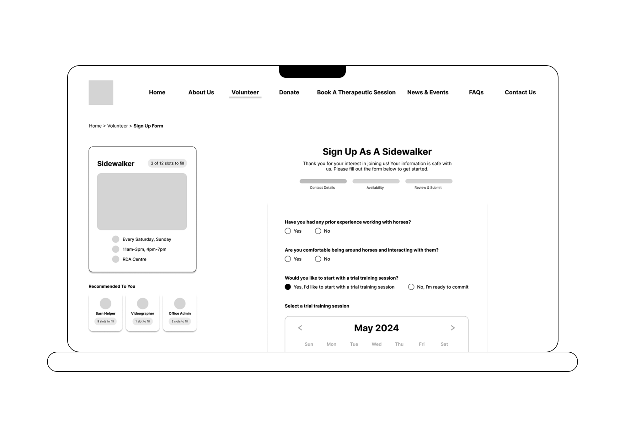
Unclear Tab Categorisation
It's unclear whether the experience-related questions belong under "Availability". Consider renaming or separating them into their own tab.
Hi-fi Prototype
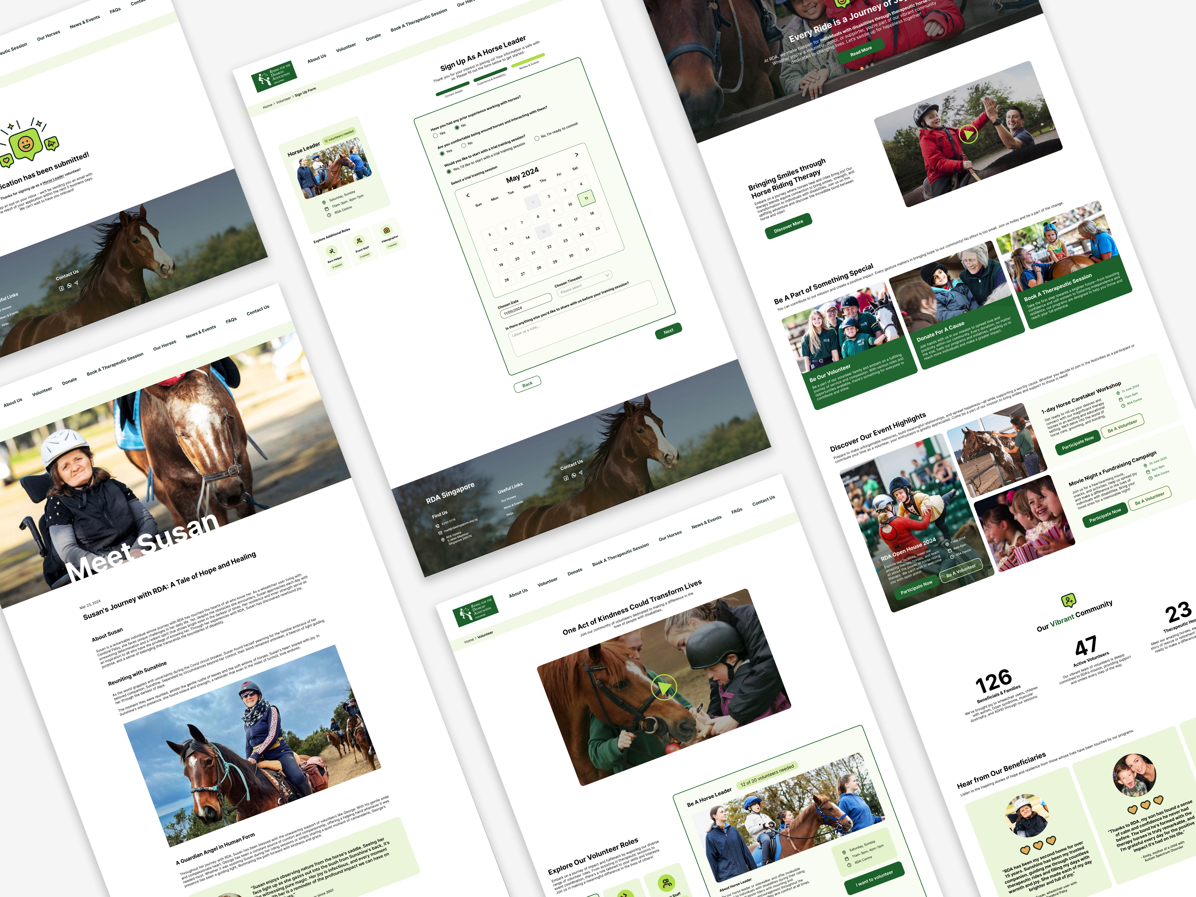
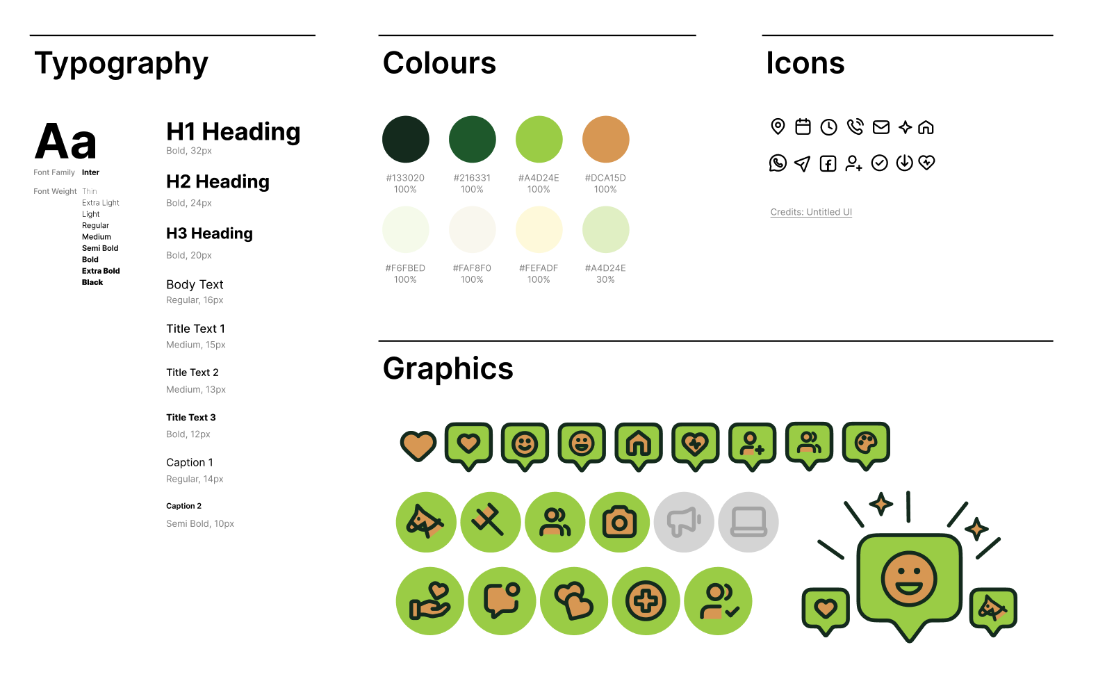
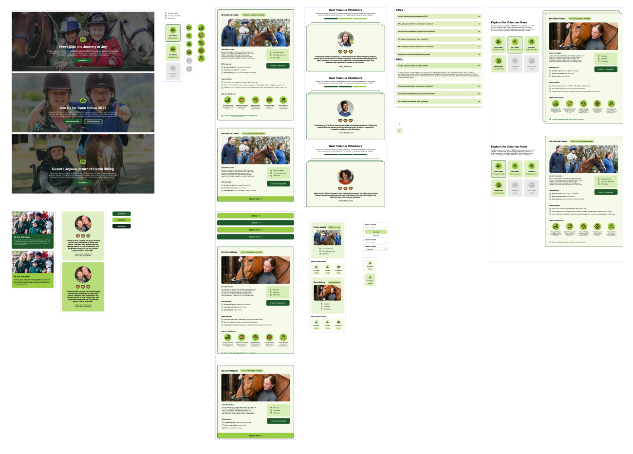
Increased Efficiency — The redesigned flow proved significantly more efficient, streamlining the journey from initial viewing to sign-up completion.
Boosted User Confidence — Users navigated the website with greater confidence, no longer hesitating or second-guessing their next steps.
Enhanced Visual Clarity — Information is now presented in a visually engaging, well-organised layout that makes content easy to scan and absorb.