Pastries Store Rebranding
Branding
2024
University
Prof. Song Kee Hong
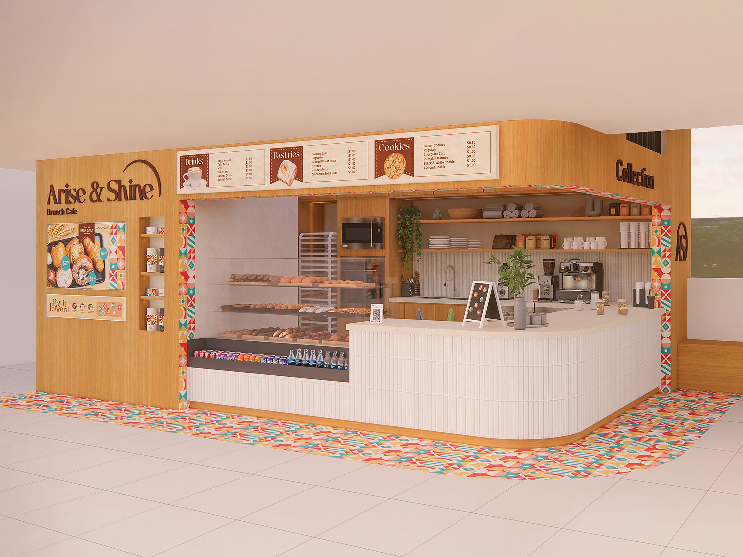
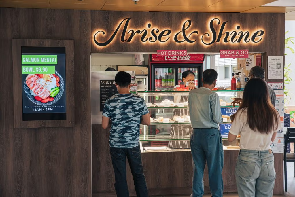
Arise & Shine has been serving warm pastries and drinks to the NUS community for years, but its space and brand identity had never kept pace.
Through on-site observations and user interviews, we identified key friction points and redesigned both the interior and exterior layout of the store. I led the visual rebrand, developing a refreshed identity that brought new warmth and character to the space.
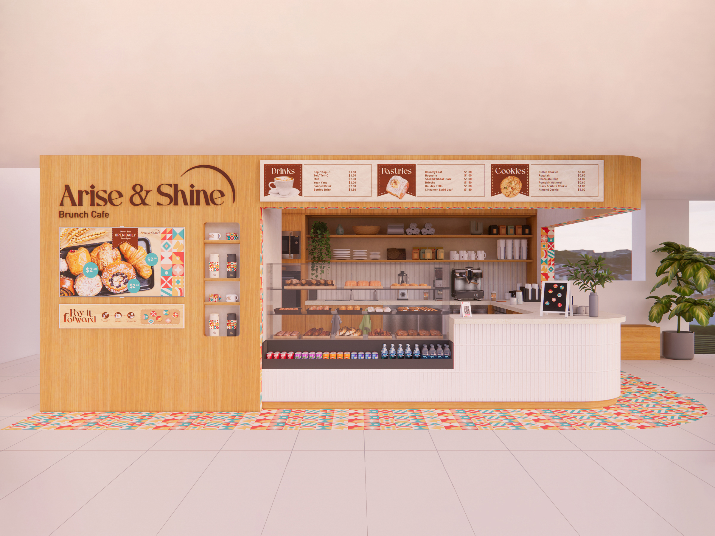
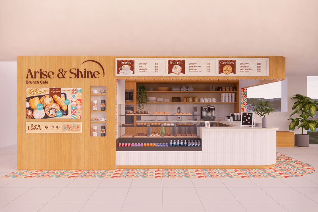
The redesign addressed a core operational problem: a confusing queue layout that was likely causing customer drop-off. By combining spatial design with a refreshed visual identity, the new layout uses branding as a wayfinding tool, guiding customers through the space intuitively while reducing friction at the point of purchase.
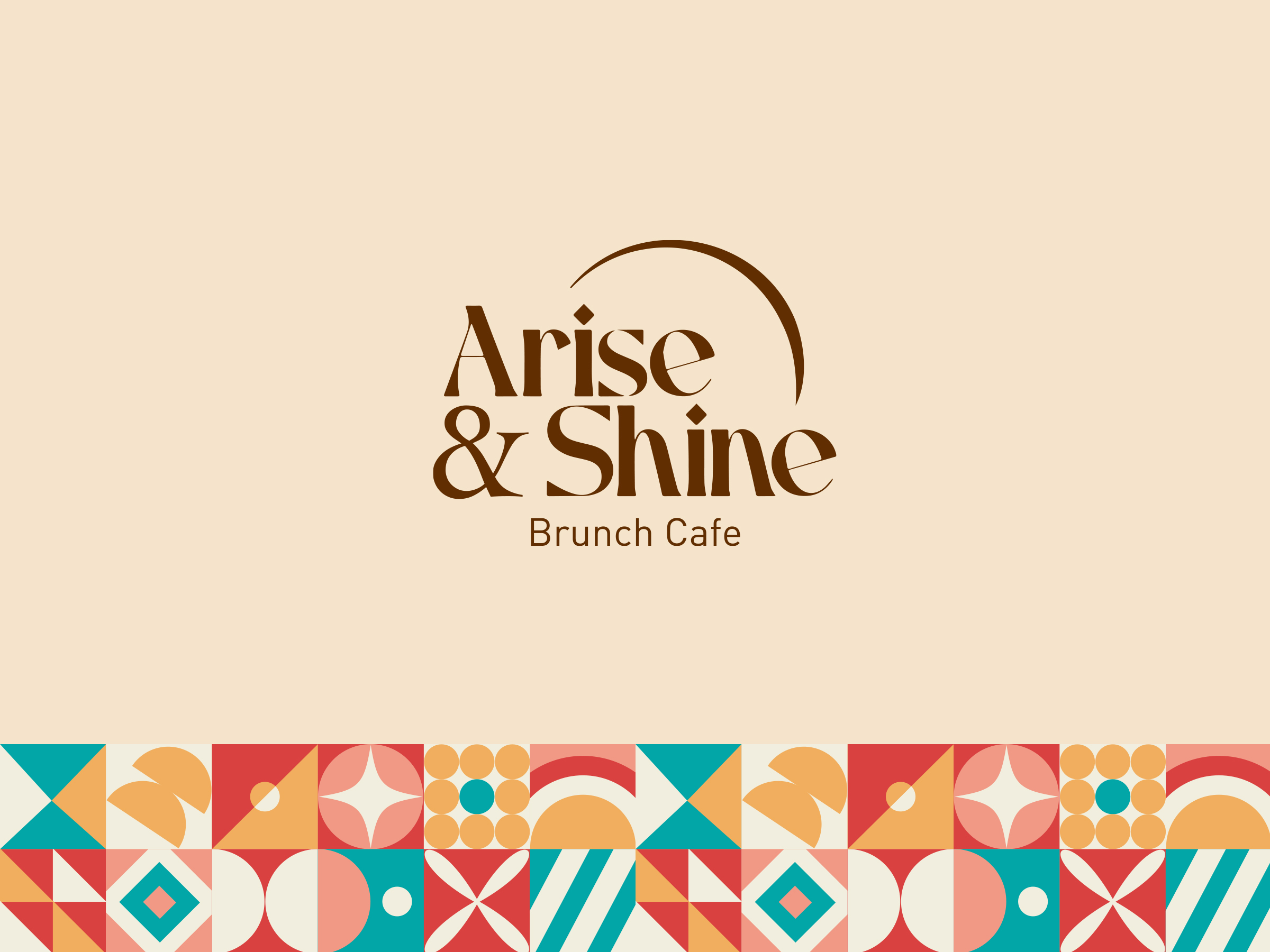
The visual direction moves toward warmth and approachability — natural timber finishes, vibrant Peranakan-inspired geometric patterns, and a rounded wordmark with a sun motif reflecting the café's uplifting spirit. The result is a brand and space that work together as one cohesive experience, familiar enough for a daily campus visit, distinctive enough to be remembered.

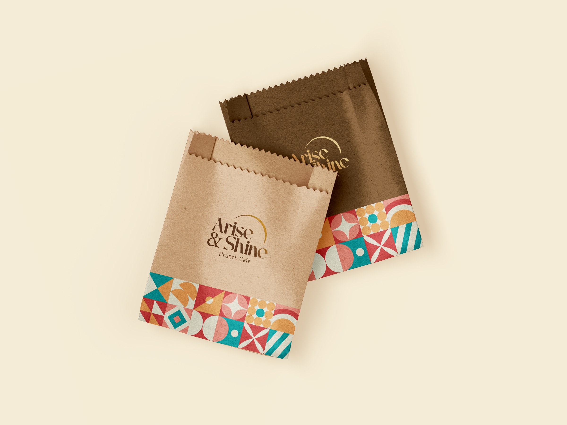

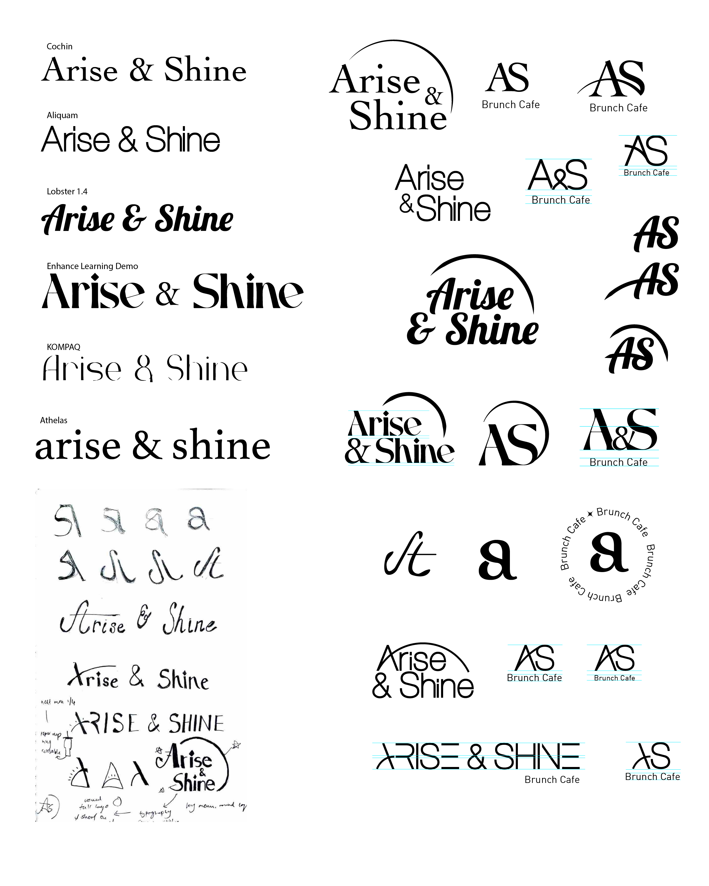
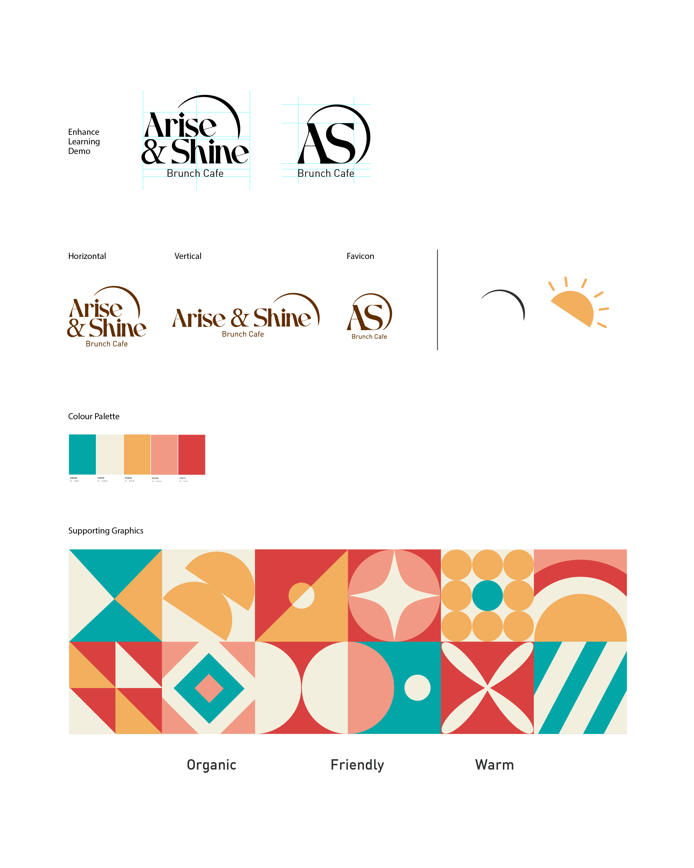
The process began with broad typography exploration and hand sketches in parallel, testing serif, display, and custom lettering directions simultaneously. The final wordmark was refined from there, a warm, rounded serif paired with a recurring arc motif representing a rising sun, grounding the brand in optimism.
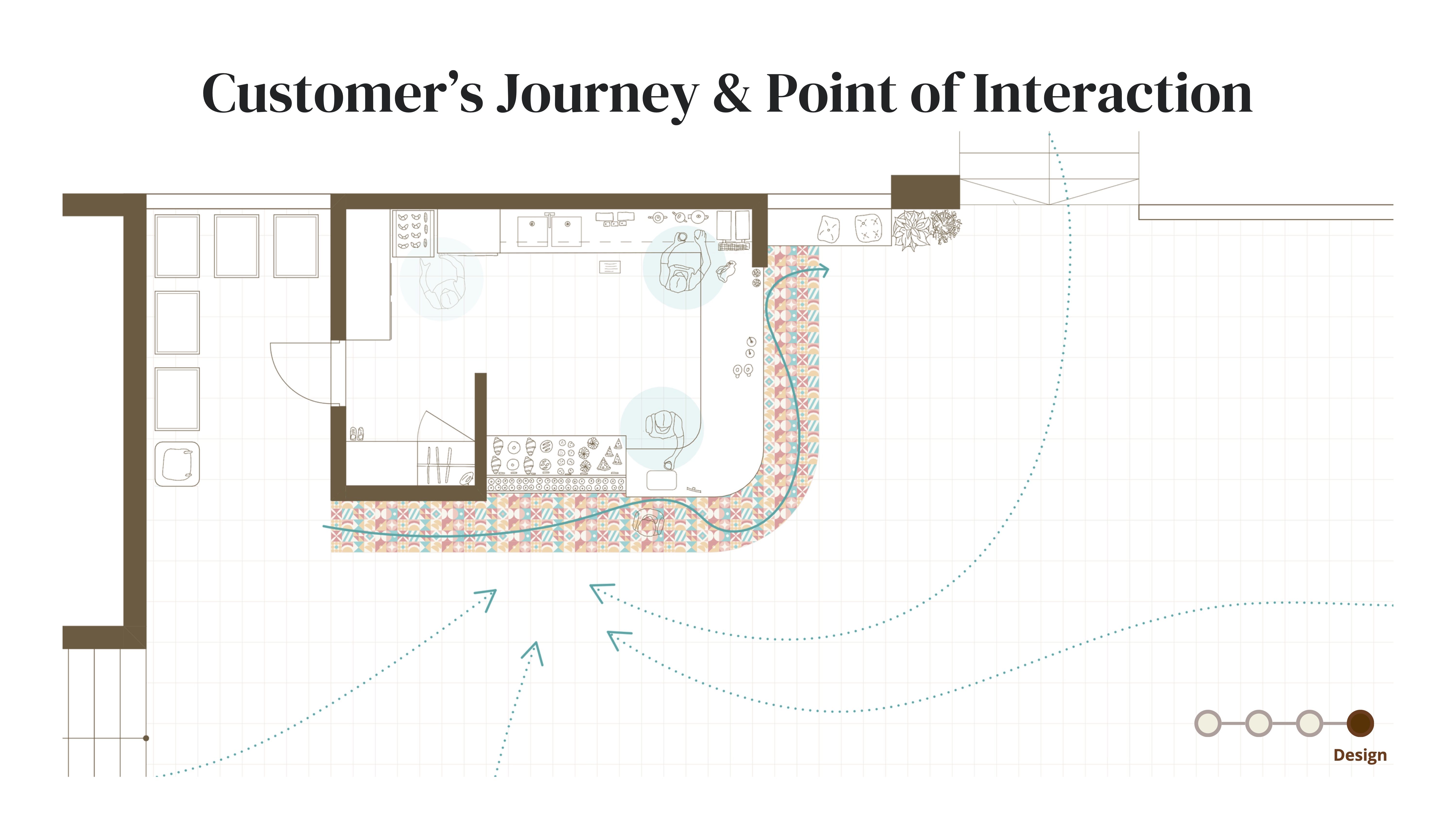
The supporting graphics do more than decorate. Their vibrant, high-contrast pattern actively guides customers through the space, directing flow from ordering to drink collection on the right. A demonstration of how visual identity can double as wayfinding.